Skip to main content
Search
Search This Blog
A Weekly Dose of Architecture Books
This blog wrapped in 2024, so visit my Substack with the same name (
archidose.substack.com
)
Pages
Home
About
Publishers
Blogroll
Books + Writings
NYC Bookstores
NYC Walking Tours
More…
Posts
Showing posts from June, 2007
Show all
June 30, 2007
Today's archidose #112
June 29, 2007
Manufactured Landscapes
June 28, 2007
3 Things
June 28, 2007
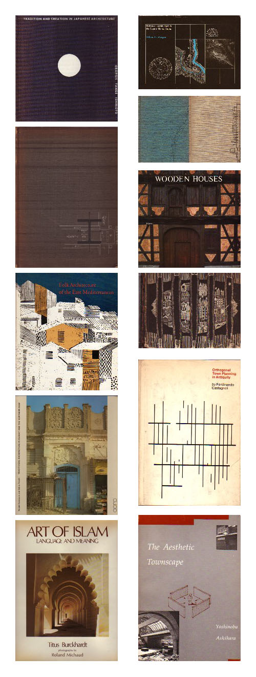
William Stout + G.E. Kidder Smith
June 26, 2007
Chicago Withers and Grows
June 26, 2007
Today's archidose #111
June 25, 2007
One Jackson Square
June 25, 2007
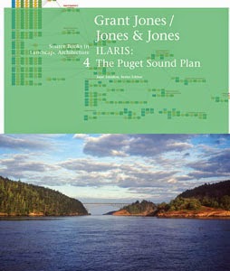
Book Review: Grant Jones/Jones – Jones
June 25, 2007
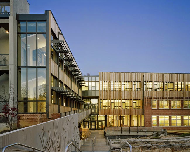
Sidwell Friends Middle School
June 24, 2007
The Science Barge
June 23, 2007
Serra at MoMA
June 22, 2007
Waves of Change
June 21, 2007
Today's archidose #110
June 20, 2007
East River Housing
June 19, 2007
Today's archidose #109
June 18, 2007
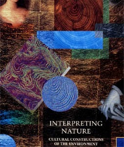
Book Review: Interpreting Nature
June 18, 2007
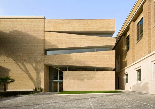
Pontifical Lateran University
Newer Posts
Older Posts
Home