Biblioteca Parque Espana

Biblioteca Parque Espana in Medellín, Colombia by Giancarlo Mazzanti
Photographs are by Sergio Gomez.
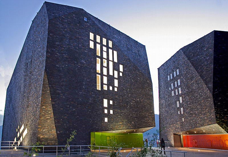
Sitting on a highly prominent location overlooking the city of Medellín, Columbia in the Santo Domingo neighborhood is the Biblioteca Parque Espana, designed by Giancarlo Mazzanti. The unique, rock-like form of the building -- split into three volumes but connected below-grade -- runs counter to one's notion of iconographic architecture today: in its formation it tries to look natural, instead of standing opposed to nature.
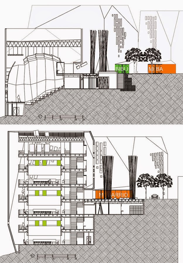
The faceted volumes are clad in a dark stone whose subtle gradation and apparently dry stacking give the simulation of monolithic landforms. Of course the reality could not be further from this distant evocation. The small diagonal grids of windows -- especially when reflecting sunlight -- hint at the spaces behind what is actually a thin skin. Once inside, one realizes that these windows relate little to the different spaces (auditorium in one volume, stacks and reading rooms in the other two) as the floor slabs are pulled away from the facade.
In effect the three volumes are simple concrete columns and slabs, laterally bracing the external stone walls. This decision to separate structure and skin by such a large margin creates some great interstitial spaces that add to the excitement created by the external appearance of the library. Mazzanti did not create a one-liner. He enriched the iconography of the faceted rocks rising from the landscape by treating the volumes as architectural gems, if you will. Inside, the simple frame and complex skin interact in a manner where the latter is always apparent, even though the former is a mystery from the outside.
Additionally, the decision to create a vertical space between the floors and walls at the perimeter recalls historical library architecture, where the relationship between center and periphery exudes meaning, from the books occupying the latter and the reader the former in Paris's Bibliotheque Nationale and Erik Gunnar Asplund's Stockholm Library, to the inverse popular in many libraries today. But it is the central void of Louis Kahn's Exeter Library that Mazzanti's design relates to the most, as he inverts that now iconic design. Where the platonic center was the void (of knowledge?), now the reader retakes the center and the void is more confusing, on the periphery and just out of grasp. A commentary on knowledge in the 21st century? Maybe, maybe not, but definitely a bold architectural statement and a wake-up call to the makers of this century's icons.


Comments
Post a Comment
Comments are moderated for spam.