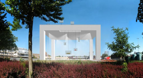
MVRDV LACKing Inspiration
This is too good not to pass along. Archinecter o d b posts this news bit:
"MVRDV selected as architects for Boijmans van Beuningen in Rotterdam with design resembling a piece of furniture [LACK series] commonly found in Ikea stores."Gotta say, I wholeheartedly agree. This MVRDV misstep reminds me of another one by a fellow Dutch office.


Wow. That's terrible.
ReplyDeleteAs far as missteps go, I'm still trying to convince myself that Lacaton Vassal's Documenta 12 Pavilion, "The Crystal Palace," is more than just a poorly conceived atrocity.
If anybody remembers this is the firm that designed the Pavilion for Holland at EXPO 2000 in Hannover, Germany. I had a chance to visit the Pavilion while in Hannover. If you are not aware of it, you just might want to visit their website. Though the EXPO is long over, their building sits on the grounds.
ReplyDeleteJohn,
ReplyDeleteWill it cost $19.99 and come in 5 pieces with a nifty little die-cut wrench? That would be classic.
Bradley Swarts
editor, ecAr
being a dutchy (plus capable od reading german), have to say that actually it does make some sense... underneath is a park (once designed by koolhaas, currently being renovated, at the other end the kunsthal is situated) and by covering it it creates a window and a frame for both the park and the kunsthal.
ReplyDeletethat, plus it's high up in the air because of global warming (that's their excuse...)
anyway, it could also have looked like this...
http://www.demakersvan.com/uploads/projecten/N08252-15-lr-1.jpg
jimmy - I couldn't find the building design on that site. D'ya have any images of the L+V project?
ReplyDeleteBrad - No, it won't have a wrench as the legs screw directly into the top...I know I've got a couple!
marten - Thanks for the explanation; I probably should have the taken the time to do a rough translation to see what it said. Given their general idea, there's numerous ways they could have accomplished the design (think of Alsop's OCAD), though gladly not along the lines of the image you linked to.
I think it is quite banal. Or maybe they want to explain that multiscalarity is possible: from the table to the buiding!
ReplyDeletethis is a very funny comparison, yet like marten, I feel the need to defend MVRDV. in their research and built work, they offer something extremely rare today: consistency.
ReplyDeletein an age where most offices change design philosophy every few years, degrading archicture to mere fashion - http://archidose.blogspot.com/2007/07/half-dose-34-panoramic-garden-of-ccis.html - MVRDV keeps developing the same themes project after project.
and one of their themes is that of a flat building raised on columns or on top of towers...and while they may not yet have proved to us what they can achieve with this particular move, surely it is not an unfamiliar design strategy to modern architects - rather than looking to IKEA, I suggest this as the original source of inspiration: http://www.flickr.com/photos/eaxio/162004000/