Coach Flagship, Omotesando
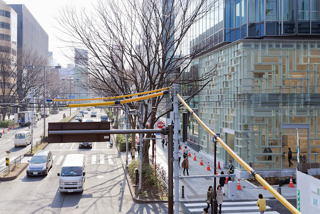
Coach Flagship, Omotesando in Tokyo, Japan, by OMA, 2013
In early April Coach opened its flagship Tokyo store on Omotesando, a strip known as much for its high-end fashion houses as for the architects designing them. Most well known are Prada by Herzog & de Meuron, Dior by SANAA, and Tod's by Toyo Ito. Coach's flagship is designed by OMA, but it departs from these other projects on Omotesando in a couple ways: Coach is part of a larger building rather than a standalone building, and the project is but one version of a design (by OMA's Shohei Shigematsu) that will be applied to various Coach stores around the world; it is not a one-off, one-of-a-kind store trying to make a statement on one of Tokyo's thoroughfares of contemporary architecture.
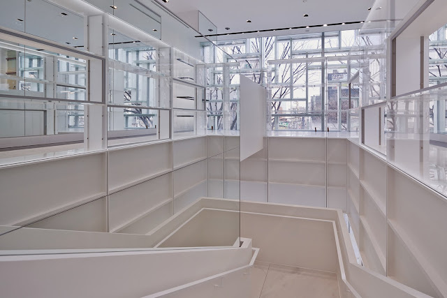
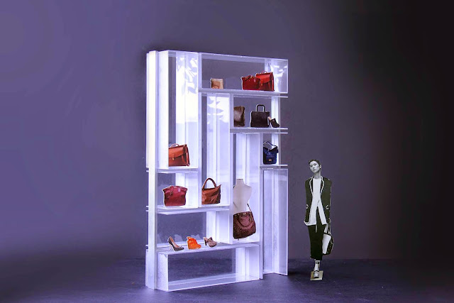
In OMA's design for Coach there are echoes of Rem Koolhaas's experiments with Prada close to 20 years ago. While the Prada stores strove to rethink retail as a cultural and social space, Koolhaas made each location unique—New York's SoHo interior is unlike the LA store, even though they exhibit similar attitudes to what a store can be. On the other hand Shigematsu worked with Coach to develop a system that could work with the company in various geographies and at various scales. Inspired by Coach's original library-like shelving, Shigematsu's system is made up of acrylic boxes that respond to the variety of leather goods the company now makes—they started in NYC in the 1940s making wallets and handbags, but now make footwear, jewelry, and much more beyond their core products. Even before the opening of the Omotesando flagship, Coach opened a relatively small kiosk in Macy's near its Broadway entrance. There the boxes are embedded with LED lights and stacked in a "V"-formation to give the store a flexible armature for displaying their goods.
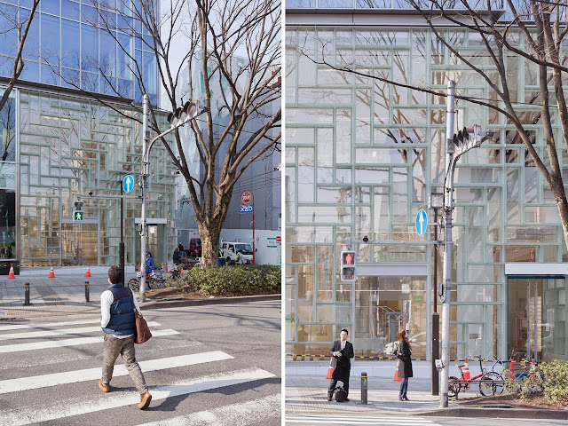
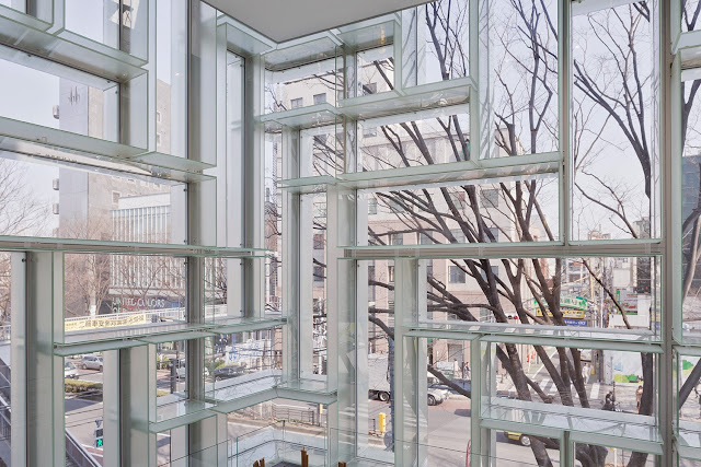
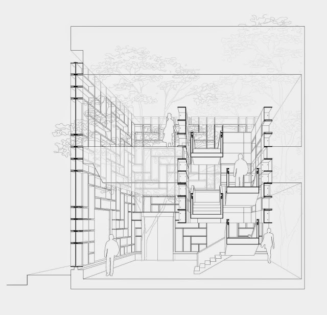
The Omotesando flagship takes this system and carries it to the exterior to make the facade a means of display. Instead of the typical storefront glass giving a view of products inside the store or in a staged display case, the glass units are an armature for purses and other products; the vertical units that make up the herringbone pattern even allow mannequins to be positioned on the exterior. The exterior glass wall is carefully detailed to allow each unit to be a focused display of a product. This happens through the frosted glass fins that extend to both the interior and exterior; their cloudy surface helps to make each piece of vision glass distinct, a small window framing one of Coach's designs.
To maintain a consistent facade, the floor inserted into the two-story space is pulled away from the exterior wall, into what's called the "floating tower." The acrylic boxes that function as the display system define the edges of the tower and allow Coach's goods to be displayed outward and inward. With the exterior glass wrapper and the interior acrylic boxes, the design's parti can be seen as a box within a box. But of course these surfaces aren't flat; they are deep and act like a series of miniature dioramas, each one putting a handbag, pair of shoes, or some other item on display and making it look like a treasured object that one must have.
Photographs are by Iwan Baan, courtesy of OMA.




Comments
Post a Comment
Comments are moderated for spam.