CTA Ugly
Brian at Gapers Block is more than correct when he points out that Chicago's subways stations are in need of some beautification, especially as a means to increase ridership. Of course we're also talking about the CTA, an organization riddled with money problems as they strive to first, upgrade one of its lines to handle unprecedented ridership and second, replace all of its front- and back-facing cars with ones that have bench seats perpendicular to the line of travel to allow for more standing room, a la New York City. Anyways, let's take a look at a couple of Metro Arts and Architecture's beauties and Chicago.
Moscow:

Munich:

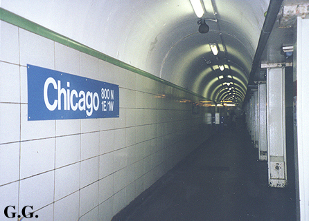
Chicago:

No, the GG doesn't stand for Good God! For frame of reference, the Chicago station shown is one of the recent overhauls (click here for its previous state). Well, at least we have the "L".
Moscow:
Munich:
Chicago:
No, the GG doesn't stand for Good God! For frame of reference, the Chicago station shown is one of the recent overhauls (click here for its previous state). Well, at least we have the "L".
The Moscow ones also have portraits of Stalin. Who do we put up? Both Daley's? Bush?
ReplyDeleteIn Europe, Chicago is known for it's gangsters, so Capone would be a good choice. Interesting juxtaposition between the Daleys' mugs.
ReplyDeleteHere in Montreal, everyone thinks it's breezy there due to it's Windy City nickname. I'm getting tired of explaining that one.
I guess it's like Philadelphia's reputation for brotherly love combined with the movie of the same name.
Montreal's stations are primarily brutalist in nature, but the touch of design is a nice change from bland Chicago stations. The rubber tires are a welcome difference for the ears.
http://en.wikipedia.org/wiki/Montreal_Metro#Design
Is that comparison really fair? I'm pretty sure that is the most lavish station in Moscow, and you have compared it to the more pedestrian of Chicago rennovations just to make a point. Maybe what you show is the norm in Munich. And you've passed up a rare opportunity to pick on NYC to the advantage of our fair city.
ReplyDeleteI'd be all for digging up the existing stations for a complete overhaul with dramatic new spaces, but we all know that's not happening.
Jeff - Sure, the rest of the Moscow stations probably aren't as nice as this one, but the same can be said about the Chicago station here. Granted that the Loop stations have a bit more breathing room with the center platform, and the Roosevelt red line stop has that nice transfer tunnel to the "L", but they're all the same design: white, blue, red tile with painted barrel vault and some perforated panels. A welcome improvement over the previous state, but nothing that comes close to other cities. And I don't think the CTA will ever fund such an operation, enlarging and "dramatizing" the undergound spaces, but it does show where the focus was to begin with: above ground. The "L" stations aren't architectural wonders either, but they don't need to be, since it's all about the ride. NYC doesn't have (much of) that luxury, though I'd rate their underground stations just above Chicago, for amenities (newstands right next to the tracks!), better tile, more generous spaces, better bences, the little details not the grand gestures.
ReplyDelete