The Architecture of Slaughter
Browsing earlier today through the thorough and well-researched Case Studies on Sustainable Buildings, I came across a project that stood out among the technology centers, educational buildings, experimental housing, and office towers included on the site: the Sheung Shui Slaughterhouse in Hong Kong.
The article explains the preference in Hong Kong for "warm" meat and the government's decision to create a central abattoir facility in 1999 in an outlying area near rail and road networks and a sewage treatment plant to help provide for this preference, while also "ensuring the highest international standards for hygiene and safety, operational efficiency and environmental management."
But before you design a slaughterhouse, ya gotta learn how one works. So let's take a look:
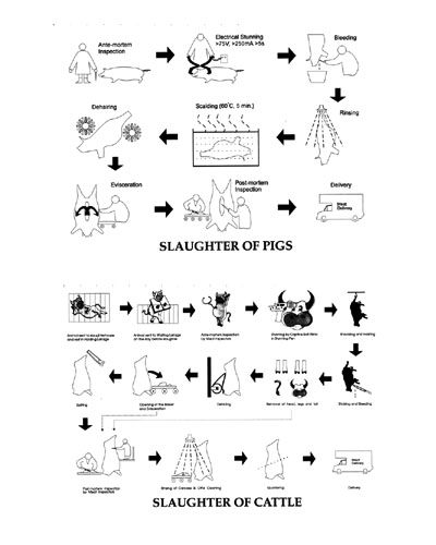
The pig appears to be electrocuted before it's drained, rinsed, and cut apart, though it's not too clear how the cow meets its fate. Nevertheless, now it's time to draw a plan:
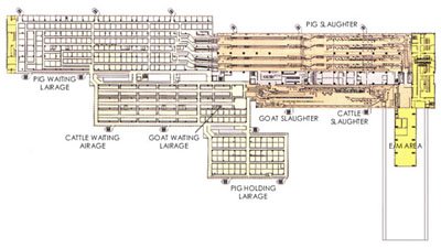
Pretty straightforward. Lairage areas for animals awaiting slaughter and slaughter areas for the slaughter itself. After that the meat is dispatched for loading into trucks to delivery the meat to the store and into millions of Chinese bellies.
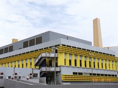
The image above illustrates that for such a functionally-driven and NIMBY building, the architects did a pretty capable job, using color and a neo-Corbusian articulation of the exterior to achieve a decent level of interest. What's that? You wanna know what those areas painted yellow are for? Well they're acoustic louvers to mitigate the noise, of pigs squealing and all those other pleasant sounds of the slaughterhouse.
The article explains the preference in Hong Kong for "warm" meat and the government's decision to create a central abattoir facility in 1999 in an outlying area near rail and road networks and a sewage treatment plant to help provide for this preference, while also "ensuring the highest international standards for hygiene and safety, operational efficiency and environmental management."
But before you design a slaughterhouse, ya gotta learn how one works. So let's take a look:

The pig appears to be electrocuted before it's drained, rinsed, and cut apart, though it's not too clear how the cow meets its fate. Nevertheless, now it's time to draw a plan:

Pretty straightforward. Lairage areas for animals awaiting slaughter and slaughter areas for the slaughter itself. After that the meat is dispatched for loading into trucks to delivery the meat to the store and into millions of Chinese bellies.

The image above illustrates that for such a functionally-driven and NIMBY building, the architects did a pretty capable job, using color and a neo-Corbusian articulation of the exterior to achieve a decent level of interest. What's that? You wanna know what those areas painted yellow are for? Well they're acoustic louvers to mitigate the noise, of pigs squealing and all those other pleasant sounds of the slaughterhouse.
5 years too late! I really could have used that plan for my post-graduate project 'Pigs in Space'
ReplyDeletehttp://rob.annable.co.uk/academic/post/pigsinspace/index.html
I couldn't get anyone to give me advice about abbatoir design.
A good document, by any chance do you have case studies of the slaughter house
ReplyDeleteNope, sorry.
Delete