AE24: Undulating Metal Fins
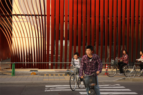
[Aomori Nebuta House in Japan by molo design (2011) | image source]
A recent building getting a good amount of press lately is the Nebuta House in Aomori, Japan by molo design. The architects describe it as "a unique cultural building inspired by the craftsmanship and spirit of Aomori's Nebuta Festival ... a form of storytelling during which heroes, demons and animals from history and myth come to life as large-scale, paper lanterns (Nebuta) illuminated from within. The building is a house for these mythical creatures, functionally meant to share the tradition, archive the history and nurture the future of this unique cultural art form." The most notable formal aspect of the building is the wrapper of "twisted steel ribbons, each shaped to create variation: openings for light, areas of opacity, views, or opportunities for pedestrian circulation."
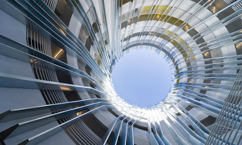
[Aomori Nebuta House in Japan by molo design | image source]
These ribbons, what I'm calling undulating metal fins, seem to be a recurring architectural element of late, the next step of straight projecting fins -- be they glass, metal, wood, or some other material -- that can be found on many facades, from cultural institutions to corporate campuses. An early example of undulations in metal can be found in the Central Signal Tower in Basel, Switzerland by Herzog & de Meuron, predating molo's building by over a decade. The earlier design undulates copper fins in a horizontal orientation to allow ventilation from the primarily solid cube; it elevates a typically mundane industrial structure into something mysterious and poetic. Molo's design turns the metal into fabric, as if the facade is draped from the roof, solidified into place after a breeze.
[Tenleytown-Friendship Library in Washington, DC by The Freelon Group (2011) | image source]
The Freelon Group's design for the facade of the Tenleytown-Friendship Library in Washington, DC, resembles molo's ribbons, in terms of color and direction, if not in undulation. Here the metal fins are angled to control daylighting, but it also gives a variable impression to the exterior, from transparent to solid. To put it another way, undulations across the facade are implied by one's perspective, rather than the manipulation of the fins. The same can be said if the pieces projected perpendicular from the glass wall behind, but the effect is more apparent with the angle, which varies depending on the facade's orientation.
[New Carver Apartments in Los Angeles, California by Michael Maltzan Architecture (2009) | image source]
In Michael Maltzan's design for the New Carver Apartments in Los Angeles, metal fins are used in the central courtyard, a circular space inside the spiral plan with a serrated exterior. The fins jog as they rise to give the cylindrical space a dynamism it wouldn't otherwise have. It's quite cinematic. And while the fins themselves don't undulate like molo's design, their angles give the effect of such.
[ThyssenKrupp Quarter in Essen, Germany by JSWD Architekten and Chaix & Morel et Associés | Photograph by Christian Richters | image source]
What may come to mind when speaking of implied movement and undulations is, well, actual movement. Some facades these days go that extra step and use operable fins to control daylight, but none is more impressive than the ThyssenKrupp Quarter in Essen, Germany by JSWD Architekten and Chaix & Morel et Associés. The louvered stainless steel fins of one building (above) aren't simple rectangular pieces; instead they zig-zag up the building, alternating with the neighboring fins to fit snuggly when closed but can appear folded or even totem-like when open, depending on their positioning.
[Carriage House in New York, NY by Christoff:Finio Architects (2008) | photos by archidose]
Getting back to literal undulating metal fins, here are a couple small projects that twist metal bars as they rise from the ground to the floor above; one I've seen in person (above, the Carriage House by Christoff:Finio Architects), while the other is in Hort Park in Singapore (below). I don't know any details on the latter, but the former impressively holds its own next to much bigger neighboring buildings designed by Richard Meier, Asymptote Architecture, and Daniel Goldner Architects. The fins control visibility into a transition space between the alley and house, but they also create a lovely texture from a simple gesture (the bars twist 90 degrees and alternate to create the pattern).


These fins really lend a sleek and modern look to structures which the comprise and adorn. They really are emblematic of the new urbanism
ReplyDeleteHi monarch,
ReplyDeleteYep you are right.
Rug Cleaning NY
www.persianrugrestoration.com