Visualizing the World, Visualizing Change
In 1939, Otto Neurath's Modern Man in the Making was released by Alfred A. Knopf. Neurath was director of the International Foundation of Visual Information and used the Isotype (International System of Typographic Picture Education) system to "teach through the eye." A recent article describes Modern Man in the Making as a "pictorial statistical history of human technological adaptation and social cooperation [that] addressed a modern audience searching for optimistic narratives amid an economically, politically, and socially volatile era." The book is a classic, and for someone like me who veers toward arguments made in a combination of words and images, it is a book I should probably have — at the very least, I should know more about it.
Although it was released as a trade book, can be found cheaply in b/w reprints, and is freely available on the Internet Archive, first editions of Modern Man in the Making go for hundreds and thousands of dollars. This is one of those books that screams out for a high-quality facsimile edition — and it will be getting that treatment early next year, courtesy of Lars Müller Publishers. The timing is curious, though, as Lars Müller just released Joy and Fear, in which Theo Deutinger brings the subjects and visual techniques of Neurath's magnum opus into the 21st century. Although Deutinger writes that his book "enters in dialogue" with Neurath's book, I couldn't help thinking that the two books side by side would heighten the differences and similarities, the constants and changes between the 1930s and the 2020s. Alas, I'll have to wait until February to do that.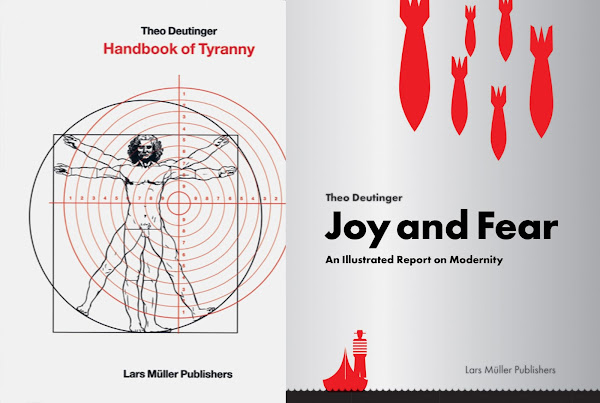
By way of illustration, the chapter on the Statue of Liberty indicates that Design Earth is not interested exclusively on the preservation and care of monuments, of places deemed heritage sites; what they symbolize is also important, revealing that inheritances involve myriad problems beyond the environmental and physical. To Ghosn and Jazairy, the statue gifted to the USA from France is about patina, poverty, and pollution: "The ecology of the color line is more than skin deep." Pollution led to damage on the skin of the statue and the need for numerous restorations, but well beyond that, "disparate exposure to pollutants," the book reads in regards to today's reframing of socioeconomic inequalities, "may help explain racial discrepancies in lung functioning." In Design Earth's imagined future, the Statue of Liberty appears to be joined by a "Brown Lady Liberty," the symbol of "a long awaited but not yet actualized freedom that was articulated over a century and a half ago."

Joy and Fear is not the first book by Theo Deutinger published by Lars Müller. That was Handbook of Tyranny, which was published in 2018 and was recently released in an updated, expanded edition. I didn't see it upon its initial release, though I did catch Deutinger's display of the book's illustrations — the walls, fences, and other means of controlling human behavior in cities — in actual objects: plants, railings, barbed wire, a prison jumpsuit and other pieces of the "routine cruelties of the twenty-first century" at the Storefront for Art and Architecture. That 2019 exhibition prompted me to get the book and then write a review: "The straightforward illustrations look like they could have been pulled from Architectural Graphic Standards, making the book read at times like an actual handbook for tyrannical dictators." Deutinger's "detailed non-fictional graphic illustrations," as described by the publisher, also owe a debt to Neurath, as evinced by the publication of Joy and Fear.
People who already own the first edition of Handbook of Tyranny won't find it necessary to buy the update, given that the changes amount to just eight new pages and consist mainly of some new paragraphs here and there, and the reordering of charts and graphics to reflect the state of the world five years later. Still, I appreciated the fact Deutinger went to the effort of an update, doing something that was de rigueur in books decades ago but is now rare, almost exclusively the province of the internet, which can be updated in close to real time. But Deutinger's illustrations — almost subversive in their dryness — are appropriate to the pages of a book; I feel like they would lose something on the screen, even though the changes impacting his illustrations happen at a clip much faster than in half-decade intervals.
 |
| Spread from Handbook of Tyranny (Expanded Edition) by Theo Deutinger, published by Lars Múller Publishers, June 2023 (Amazon / Bookshop) |
In between Handbook of Tyranny and Joy and Fear, Deutinger and Lars Müller put out Ultimate Atlas: Logbook of Spaceship Earth, a book that uses lines — and nothing else — "to create a total portrait of the planet." No wonder one review calls it "the ultimate simplification of reality." I haven't seen that book, but visually it seems that Joy and Fear strikes a balance between the highly detailed illustrations of Tyranny and the minimalism of Ultimate Atlas, as if Neurath's Isotype cannot be improved upon in describing the state of the world over time. As described above, Deutinger's book "dialogues" with Neurath's nearly century-old book. It does this by extending the timeline to the present and adjusting some data visualization from the original; the latter updates are highlighted with the icon of a person holding up a sign. What does the book reveal about the modern world? Clearly, yet unfortunately and not surprisingly, that progress is being made by the few, not the many: geographically, demographically, politically, economically, etc.
 |
| Spread from Joy and Fear: An Illustrated Report on Modernity by Theo Deutinger, published by Lars Múller Publishers, September 2023 (Amazon / Bookshop) |
The spread above can serve to illustrate how the book works. The red, blue, and black chart on the left shows household ownership of amenities in the USA, from 1910 to 2020, including such items as computers, phones, wifi, telephones (cell and landline separately), toilets, and electricity. Most of the amenities are full as of 2020, though only one — landline telephones — is in decline. Though the same chart for other geographical areas would be telling, the opposite page shows an update version of data viz. from Neurath's 1939 book: radios, TVs, and cars in the 1930s (top) and 2020s (bottom) in the six geographical regions used throughout Deutinger's book (USA and Canada, Europe, CIS, Latin America, Southern Territories, Far East). Although the scales change between the two charts, it's clear that the regions in the bottom rows (Latin America, Southern Territories, Far East) have become more modern in recent decades. But it's up to the reader to speculate on what so many cars mean, for instance, to our warming planet.

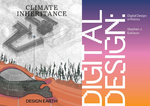
Visualizing how the continued burning of fossil flues will impact our warming planet is one subject of Climate Inheritance, the latest book from Design Earth, the brilliantly inventive studio of Rania Ghosn and El Hadi Jazairy that previously wrote and illustrated Geographies of Trash (2015), Geostories: Another Architecture for the Environment (2018), and The Planet After Geoengineering (2021). The cover features one of the many beautiful illustrations populating the book: a diagram of aquifers refilled by injecting storm water into "bladders" that serve to raise the sinking city of Venice. Venice and its Lagoon is one of ten sites in the book, each one on the UNESCO World Heritage List. Others include the Galápagos Islands, Sagarmatha National Park, and the Statue of Liberty. What is the future of such places — heritage sites that are already preserved to a greater extent than other places — when the Anthropocene leads to inherited conditions future generations may not anticipate?
 |
| Spread from Climate Inheritance by Rania Ghosn and El Hadi Jazairy (DESIGN EARTH), published by Actar Publishers, August 2023 (Amazon / Bookshop) |
One more book that joins with the other three to be — in my mind, at least — an illustration of how images are effective in describing the world and the way it changes over time is Stephen J. Eskilson's Digital Design: A History. Eskilson's book, unlike the other three, does not use newly created images to create a narrative, but the story that he is telling is about images: design in its various aspects, from graphic and industrial design to architecture and data visualization. It's a history that needs to be told, especially since people now born into the digital world don't realize how developments in design from the 20th and even earlier centuries shaped our digital present — and likewise will shape our digital futures.
Architecture is the subject of two chapters: "Digital Architecture I: Origins" and "Digital Architecture II: Parametrics and 3D Printing." (The latest buzz in architecture — and just about every realm, really — AI, is treated in its own chapter.) In the first architecture chapter, Eskilson moves from the Sydney Opera House, in which "[Ove] Arup pioneered the use of computational analysis," to Peter Cook and Colin Fournier's Kunsthaus Graz via Frank Gehry in Bilbao, Deleuze and Guattari's A Thousand Plateaus, and Greg Lynn. The second chapter jumps ahead to Zaha Hadid and Patrik Schumacher, especially the latter's wholehearted, sometimes controversial embrace of parametricism, while also looking at how digital software bridges construction via 3D printing and robotics. This is design history, remember, so there is nothing novel in what Eskilson discusses, but he succinctly traces some of the most important developments to describe our current condition. (Unfortunately, one typo — and I hope it's just that — distracted me while reading the first architecture chapter: Eskilson calls AD, the "magazine that associated digital architecture with aspects of structuralist theory," Architectural Digest instead of Architectural Design! I can't think of more polar opposites than these two publications sharing the first term and abbreviation but having very little else in common.)
 |
| Spread from Digital Design: A History by Stephen Eskilson, published by Princeton University Press, October 2023 (Amazon / Bookshop) |
Even with two architecture chapters among its twelve chapters, most interesting to me is the chapter devoted to data visualization, a subject that is also strongly aligned with Neurath and Deutinger. Like other chapters in the book, Eskilson briskly covers decades and centuries in just around twenty pages, moving from 18th-century charts and graphs to digital data on websites, across buildings, and on the walls of galleries. Some of what makes this chapter so appealing is the abundance of examples unknown to me, such as Nam June Paik's Electronic Superhighway (1995), which is pictured above, has a permanent home at the Smithsonian American Art Museum, and now I feel I must go see. (That said, I wish the book had a list of books for further reading, and I am surprised that a book published by a university press has no footnotes at all.) More recent examples are really interesting, including Oliver O'Brien's Tube Tongues (2014), an interactive map that shows the prevalence of non-English speaking in different London neighborhoods. Rising to the fore re: data viz., though, is the importance of design/the designer in making data in digital environments visible and understandable, especially when the output is on a website and via an API, for instance, rather than in a book and done by an illustrator. The books above may be old-fashioned, just by the fact they are books rather than digital environments, but they offer plenty to consider in regards to thinking about and visualizing the world around us — now and in the future.
Comments
Post a Comment
Comments are moderated for spam.