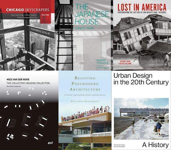
Wednesday, July 15, 2009

Contemporary Bibliography
"For Pierre Restany it was the society founded on the eternal that was obsessed with the values of permanence and materiality; today, instead, we share the understanding, matured from the 1960s onwards, that what is real is not eternal. ... The danger of contemporary culture is not the freshness of the image, its here and now, but rather its freezing, mummifying it in a form that remains immutable over time. The obstinate hope for perrenial monuments in the end testifies to a headstrong obtuseness that we have dragged behind us since the time of the Egyptians, and which consists of wanting, at all costs, to exorcise death and refuse the deeper meaning of life, which is precisely that of mutability."
- Luigi Prestinenza Puglisi from New Directions in Contemporary Architecture: Evolutions and Revolutions in Building Design Since 1988 (Wiley, 2008, pp. 111)

(Luigi Prestinenza Puglisi's book contains a bibliography of "50 books, 10 of which are must-haves." I don't have all of the must-haves, but I do have 10 of the 50, pictured above.)

Labels:

0 Comments:

Post a Comment

<< Home

Tuesday, July 14, 2009

Here's a tour of some Dutch buildings photographed by Helioscribe.

Sabic Europe Head Office
[Sabic European Head Office in Sittard by Group A]

Smarties
[Smarties, Uithof (student housing) in Utrecht by Architectenbureau Marlies Rohmer]

Wozoco Apartments
[WoZoCo Housing in Amsterdam by MVRDV]

Qubic
[Qubic (student housing) in Amsterdam by HVDN Architecten]

Animal Shelter
[Animal Refuge Center in Amsterdam by Arons en Gelauff Architecten]

To contribute your Flickr images for consideration, just:

:: Join and add photos to the archidose pool, and/or
:: Tag your photos archidose

Labels:

2 Comments:

At Tuesday, July 14, 2009 11:37:00 PM, Blogger Des said...

This is really cool. Thanks for posting this.

 
At Wednesday, July 15, 2009 4:16:00 AM, Blogger justice said...

really i fell in love with this lovely attractive architecture. Because it looks very magnificient. It can not be expressed in one or two lines.

justice

Outsources BPO & Call Centre Solution


Post a Comment

<< Home

Monday, July 13, 2009

My weekly page update:
image01sm.jpg
Showroom Ofimodul in Monterrey, Mexico by stación-ARquitectura Arquitectos.

This week's book review is Everyday Urbanism, edited by John Chase, Margaret Crawford, and John Kaliski.

Some unrelated links for your enjoyment:
WPA 2.0
"An open competition that seeks innovative, implementable proposals to place infrastructure at the heart of rebuilding our cities during this next era of metropolitan recovery." Registration deadline is July 24.

jargon, etc.
"Critical thinking and simple understanding" of "architecture, places, potentials and urbanism." (added to sidebar under blogs::architecture)

Architecture Revived
A one-year old blog with a bunch of projects and a logo with a resemblance to a certain magazine. (added to sidebar under blogs::architecture)

tropicalismo
A blog from a literally global architect. (added to sidebar under blogs::architecture)

DESIGN DAILY
"On-line design newspaper." (added to sidebar under blogs::design+technology)

4 Comments:

At Monday, July 13, 2009 10:04:00 AM, Blogger Charles said...

How do I add my site to your links? www.scalehousedesign.com
Thanks
cwitmer@scalehousedesign.com

 
At Tuesday, July 14, 2009 10:02:00 PM, Blogger Ben said...

What magazine is my icon from? Seriously I don't know, I just picked it out...

Thanks for the link.

-Architecture Revived

 
At Tuesday, July 14, 2009 10:21:00 PM, Blogger John said...

Ben - It reminded me of Architectural Record, though when I actually take a look at one of their covers it's certainly not a copy. Your logo still makes me think of it...maybe the resemblance is to an old version of the magazine.

 
At Wednesday, July 15, 2009 4:21:00 AM, Blogger justice said...

i like this lovely site because it is a mixture of light colour. It creates a sense of appearance in nature.

justice

Outsources BPO & Call Centre Solution


Post a Comment

<< Home

Sunday, July 12, 2009

On Friday I attended an Architectural League lecture by photographer Christopher Payne, whose book Asylum: Inside the Closed World of State Mental Hospitals will be released this fall by MIT Press. Payne gave a brief history of the institutions, a subject I gained some familiarity from reading Carla Yanni's The Architecture of Madness. An architect by training, he discussed the typical plans of state hospitals, their grounds, and the impact of the edifices on their localities, followed by slides of his beautiful and moving photographs.

asylum1.jpg
[Buffalo State Hospital Ward, 2009 by Chris Payne | image source]

What Payne was most enthusiastic about after his years of travels and shot-taking was the self-sufficiency of the places that grew their own food, made their own clothes, produced their own power, and in other ways basically lived "off the grid." He discovered parallels and inspiration with our current predicament, where self-sufficiency as a community goal is commendable, if not completely realistic. My studies in urban design stressed such an approach, though I'm suspect of an appreciation of places that disavows the circumstances of their self-sufficiency. Were the state hospitals self-sufficient due to their physical situations detached from cities (urban places were seen as harmful for mental recuperation around 100 years ago), or because the patients were removed from a society that did not want them? If it's the latter to any degree, how commendable is the self-sufficiency of state hospitals?

One aspect of the deterioration of state hospitals -- why they are being photographed as ruins and not architectural masterpieces -- is the rise of psychotropic drugs in the middle of last century and the shift from remote locations to community-based treatment. These factors led to reduced populations in the institutions, meaning less free labor for the farming, sewing, cooking and other activities that went into making the places self-sufficient. So basically this admirable trait arose from taking advantage of the inhabitants, like in prisons, which some of the state hospitals have actually become. Can this model be replicated in communities that strive for the self-sufficiency propounded by some? Hardly, though I wonder what would happen if people really tried to resuscitate these structures and their surrounding land as communities, instead of demolishing them to make way for suburban developments? If tried they might just become experiments that fade away in the 100-year time period of the state hospitals, though the same might be said of the suburbia that replaces them.

3 Comments:

At Monday, July 13, 2009 8:36:00 AM, Blogger charlotte said...

thank you for sharing this - amazing.

 
At Monday, July 13, 2009 10:32:00 PM, Blogger thomas said...

On the photogs website there are images os the exteriors of these buildings. They look like 17th century chateaus, and English country estates. I guess they chose these styles to evoke some kind of stability, but they also evoke aristcracy. I guess it also evokes the Marquis DeSade too.
Thanks for the post and commentary.

 
At Wednesday, July 15, 2009 4:24:00 AM, Blogger justice said...

the architecture of the asylum is so lovely and amazing. It symbolises the presence of unity and integrity and it creates a sense of hopeness specially among the patients.

justice

Outsources BPO & Call Centre Solution


Post a Comment

<< Home

Friday, July 10, 2009

Here are a couple views of the Portland Harbor Hotel -- the "addition of a 5-story contemporary glass volume and expansion of an existing hotel into an adjacent historic structure" -- in Portland, Maine by Archetype Architects. Photographs are by KMGough.


To contribute your Flickr images for consideration, just:

:: Join and add photos to the archidose pool, and/or
:: Tag your photos archidose

Labels:

5 Comments:

At Friday, July 10, 2009 1:51:00 PM, Blogger oca said...

genial!

 
At Saturday, July 11, 2009 8:22:00 AM, Blogger Curtis said...

Great use of old curtains. That must be one hot building in the summer time!

 
At Sunday, July 12, 2009 2:27:00 AM, Blogger the real nick said...

Hurray. Contextual & sustainable building design a' la Mies is back!

Hotel rooms fully glazed? perfect!

 
At Sunday, July 12, 2009 8:47:00 PM, Blogger StructureHub Blog said...

I generally approve, although I wish the windows were recessed a bit into the facade so it didn't seem so paper-thin of a structure, compared to the more textured surfaces of its neighbors.

 
At Wednesday, July 15, 2009 4:27:00 AM, Blogger justice said...

the lightings increased the importance of shops. It glitters and i think it is one of the most attractive site among all previous sites.

justice

Outsources BPO & Call Centre Solution


Post a Comment

<< Home

Thursday, July 09, 2009

Looking for a good investment these days? Something that might increase in value from, say, $75.00 to $836.00 in less than ten years? Well be sure to pick up a copy of Seeing Zumthor--Images by Hans Danuser: Reflections on Architecture and Photography by Hans Danuser and published by Scheidegger & Spiess. It will be released on July 15.

zeeing1.jpg
[image description | image source]

At only 88 pages and just under 50 bucks retail it's not exactly cheap, but it is Zumthor, and in the world of architecture books he's the man. If the photos by Danuser below are any indication the imagery is dramatic and drenched in moodiness, just amazing to look at. They are clearly "photographs that comment equally on the art of photography and the art of architecture."

zeeing2.jpg
[Saint Benedict Chapel in Sumvitg, Graubünden, Switzerland photographed by Hans Danuser | image source]

zeeing3.jpg
[Saint Benedict Chapel in Sumvitg, Graubünden, Switzerland photographed by Hans Danuser | image source]

From the book's description:
"More than twenty years ago, in a milestone event of twentieth-century architectural photography, Danuser photographed, at Zumthor’s invitation, two buildings: the protective structure built for archaeological excavations in Chur and St. Benedict’s Chapel in Sumvitg. When first shown in exhibition, those photos ignited a lively debate that has been revived with a recent exhibition of Danuser’s photographs of Zumthor’s most famous work, the spa at Therme Vals. Seeing Zumthor collects these three important series of Danuser’s pictures and includes essays by leading art historians [a discussion between Köbi Gantenbein and Hans Danuser and an essay by Philip Ursprung] exploring the relationship between the two seemingly different disciplines or architecture and photography."

Labels:

2 Comments:

At Friday, July 10, 2009 12:26:00 AM, Blogger eBohn said...

Work it, John!

 
At Wednesday, July 15, 2009 4:29:00 AM, Blogger justice said...

the structure of this site is so magnificent because it is made of purple colour. This colour symbolises the presence of unity and integrity.

justice

Outsources BPO & Call Centre Solution


Post a Comment

<< Home

Wednesday, July 08, 2009

Aberstwyth Art Centre's Business Units in Aberstwyth, Wales by Heatherwick Studio, 2009.

To contribute your Flickr images for consideration, just:

:: Join and add photos to the archidose pool, and/or
:: Tag your photos archidose

Labels:

6 Comments:

At Wednesday, July 08, 2009 11:01:00 PM, Blogger 'ShE's'~DustfingerNaiL said...

wow~ loved it!

 
At Thursday, July 09, 2009 12:09:00 PM, Blogger little hungry sharc said...

Silver foil?

 
At Thursday, July 09, 2009 12:53:00 PM, Blogger John said...

The architect describes it so: "As stainless steel is everlasting but expensive, the studio sourced steel the thickness of cooking foil. This makes it affordable, but it crinkles easily, providing neither structural rigidity nor insulation. These problems are overcome by crinkling it in a controlled manner before spraying a CFC-free insulation foam on the back of the crinkled surface."

 
At Thursday, July 09, 2009 3:26:00 PM, Blogger Paul said...

Does the foam, which lines the underside of the crinkled steel, provide rigidity? I.e., if I press my fingers on the exterior, will it crinkle or remain static, frozen in the form that the insulation hardened?

Heatherwick Studio has certainly proven itself a visionary when it comes to metal-exterior projects...

 
At Thursday, July 09, 2009 9:57:00 PM, Blogger thomas said...

Expanding foam can be made to cure to varying degrees of hardness.
I wonder about the safety of the expanding foam; if thereis any off - gassing; especially when its used in large amounts. I know if you mix expanding foam yourself, in small batches, its very toxic, and off-gases for a long time.
Thanks for posting.

 
At Wednesday, July 15, 2009 4:32:00 AM, Blogger justice said...

the mixing of green and white colour symbolises the importance of creativity and greenness. Green colour is very good for our eyes.

justice

Outsources BPO & Call Centre Solution


Post a Comment

<< Home

Within the span of one week I came across two buildings, storage sheds, that each use polycarbonate panels, a cladding material not uncommon today. A quick flip through the chapter on plastics in Victoria Ballard Bell and Patrick Rand's Materials for Design reveals eight structures that use polycarbonate, be it a bus shelter, church, gallery or residence. Nevertheless it was quite a coincidence to see such similar types of buildings receive such similar treatment.

The Storage Barn in Washington, Connecticut is by Gray Organschi Architecture and is featured at Archinect. The small structure accommodates materials on palettes for the client, a builder. At first it reminds me of SPF:architects' Somis Hay Barn (featured in AE12), another storage shed whose appearance is constantly modified by the amount and configuration of materials stored. In that case it's hay, in this case it's wood and stone. The polycarbonate panels sit behind the materials stored under a shallow eave; they line the interior space and allow light to pass between the materials outside.

poly-stor1.jpg
[Storage Barn by Gray Organschi Architecture | image source]

In Munich, Germany, 03 München has created a building for Firma Kraft Baustoffe, found at german-architects via their eMagazin. While on a much larger scale than the project above, and incorporating other functions besides material storage, the high shelf (empty in the photo below and full at bottom right) is basically the same parti as the Connecticut storage barn; materials sit in front of the polycarbonate wall lining the interior space. The main differences here are the scale of the storage, the extent of the roof covering the materials and the access road underneath.

poly-stor2.jpg
[Baustoffhandel Kraft by 03 München | image source]

Neither project really expands on the use of polycarbonate panels, as exhibited in Materials for Design, for example. The translucent corrugated sheets are prized for admitting light, being lightweight and their resiliency to varying weather conditions. The material's use in these two projects is also due to its impact resistance, greater than glass. Therefore it is suitable in an area where palettes and their materials may inadvertently collide with the wall, all the while admitting the necessary light inside. The use of polycarbonate panels elevates what are basically functional sheds into glowing boxes with ever-changing appearances.

Labels:

2 Comments:

At Wednesday, July 08, 2009 1:39:00 PM, Blogger thomas said...

Interesting post. While maybe not being particularly innovative theoretically or formally, vernacular buildings can bring newer ideas and materials into actual practice. I like the way these structures are kind of "dumb" They aren't haunted by language in the way that "important" architecture is.
I think it proves that there's still something to the form/ function dialectic.

 
At Wednesday, July 15, 2009 4:34:00 AM, Blogger justice said...

I am so inspired when I came across this lovely architecture. Really the architecture on the free land I likes very much

justice

Outsources BPO & Call Centre Solution


Post a Comment

<< Home

Tuesday, July 07, 2009

Chair in the Illustration Department at Parsons New School and former Art Director for the Op-Ed page of The New York Times, Steven Guarnaccia reimagines the protagonists in his version of the Three Little Pigs in guises familiar to architects:

3pigs1.jpg

As the publisher describes: "Frank Gehry, Le Corbusier and Frank Lloyd Wright are in fact the main protagonists of this contemporary tale with other renowned architects in their houses of scraps, of glass and of stone and mortar. In their famous buildings they live among objects designed by some of the most internationally representative architects and designers. But one day the wolf pays a visit to them..."

3pigs2.jpg

(Spotted in CCA Bookstore's July PDF listing.)

Labels:

4 Comments:

At Wednesday, July 08, 2009 4:47:00 AM, Blogger EKP said...

Great idea! Is it on Amazon?

 
At Wednesday, July 08, 2009 2:30:00 PM, OpenID chicagomontreal said...

Would you like me to walk over and pick up a copy for you?

 
At Saturday, July 11, 2009 9:21:00 PM, Blogger John said...

EKP - Not yet...at least I'm guessing it will be at some point.

chicagomontreal - For me or EKP? I can't speak for the latter, but we've yet to read the little one "Roberto, The Insect Architect." She's got a little time before she's beyond chipboard books.

 
At Wednesday, July 15, 2009 4:36:00 AM, Blogger justice said...

it is so funny and it symbolises the presence of animal which looks very tricky and gorgeous. It gives a lot of encouragement among the children.

justice

Outsources BPO & Call Centre Solution


Post a Comment

<< Home

Monday, July 06, 2009

Nine minutes and fifty-seven seconds, to be precise, is the length of the Bartlett School of Architecture, Year 1's End of Year Film 2009.


The stop-action film is a very creative presentation of the class's installations, projects and travels. The school's "new wave of different architectures" is apparent in the film, even though depth of presentation is lacking in its rapid-fire style. But that's probably the point, eh? Convey the essence of the school's architecture department by using the images and sounds of the medium of film/video as a supplement to architectural production. The film's concept parallels the architectural concept. Whatever the case, it's refreshing to see that drawing and physical model-building are still taught in architecture schools today.

(Thanks to Patrick for the heads up!)

4 Comments:

At Monday, July 06, 2009 10:58:00 PM, Blogger E said...

Seems more like an art major's production lol

 
At Tuesday, July 07, 2009 5:44:00 AM, Blogger Stavros Martinos said...

the Athens part was pretty impressive

 
At Wednesday, July 08, 2009 6:12:00 PM, Blogger H00b1e, the Telescope said...

This is the kind of work that drew me away from the architecture movement of today and forced me to look more practically at the profession. You can argue that the university is supposed to act as a laboratory for new ideas and new ways of seeing. In that, their work succeeds. But in the practice of architecture the profession, there is very little that seems they are being prepared for - unless it is a field in the sculptural arts or to partly steal a phrase "a sculpture for living in". The second meme of the work is one I've seen in other "Architecture NOW" type books, where the structure acts as an expressive stage prop for what it does, i.e. the marrionette building and the use for strings in the structure. This is sort of a derivative of the idea i.e. putting the function of the object or space into the function of the wrapper or architectural skin. You see the symbolism of man in the cross shaped floor plan of cathedrals, but this sort of mimicry is at a more literal levels.

I'm not convinced if this is a positive or negative development yet - if there is any gain by it - but it is an observation.

 
At Wednesday, July 15, 2009 4:38:00 AM, Blogger justice said...

it creates a sense of intelligent and thought in the minds of the students. really the picture is so imaginative and it improves the skill, knowledge and abilities of the student.

justice

Outsources BPO & Call Centre Solution


Post a Comment

<< Home

Thursday, July 02, 2009

I'm taking a long 4th of July weekend out of town away from the city and computers. Posts will resume early next week. My weekly page will resume on July 13.

july4.jpg

1 Comments:

At Wednesday, July 15, 2009 4:40:00 AM, Blogger justice said...

An excellent shot! It is so amazing and creative in nature. It sparkles the eyes of the people and the colour is very beautiful.

justice

Outsources BPO & Call Centre Solution


Post a Comment

<< Home

Here are some views of the Castel Firmiano Messner Mountain Museum in Bozen, Italy by Werner Tscholl. Photographs are by Martino Pietropoli.

BZ_20090613_ IMG_3666 (1)

BZ_20090613_ IMG_3578 (1)

BZ_20090613_ IMG_3589 (1)

BZ_20090613_ IMG_3734 (1)

BZ_20090613_ IMG_3692 (1)

BZ_20090613_ IMG_3705 (1)

To contribute your Flickr images for consideration, just:

:: Join and add photos to the archidose pool, and/or
:: Tag your photos archidose

Labels:

3 Comments:

At Thursday, July 02, 2009 3:16:00 AM, Blogger martino said...

Thanx for your consideration.

 
At Tuesday, July 07, 2009 1:01:00 PM, Blogger kashuo said...

Whoah nice steps!

 
At Wednesday, July 15, 2009 4:42:00 AM, Blogger justice said...

I like to arrange this place especially for picnic. Because it is a really good site and it is suitable for picnic. the appearance of the picture is so excellent.

justice

Outsources BPO & Call Centre Solution


Post a Comment

<< Home

    main.jpg
    books.jpg

Enter your email address:

Delivered by FeedBurner