McMakeover
The northeast corner of Chicago and State Streets, about a quarter mile west of the Magnificent Mile and the Water Tower, has been home to a McDonald's for quite a while. The location has also existed as an overlap between the affluence and consumerism to the east and the grittier area to the west, with YMCA residents and other "undesirables", to use Jane Jacobs's term, frequenting the McDonald's and other nearby establishments. The recently-opened makeover of the McDonald's, in tune with the adjacent subway renovation with its neo-traditional canopies, threatens to destroy this unique clashing of class and race, or does it?

The above view is the approach from the east on Chicago Avenue. Two drive-thru lanes are off camera to the right. An entry is under the second of four golden arches from the right, under a canopy highlighted with more golden arches. Beyond the overly-large, cantilevered sign is a fenced-in, corner park, visible below.

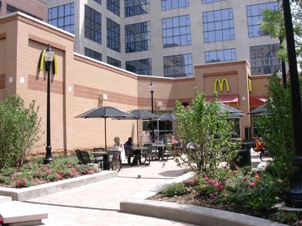
The building is an "L"-shape plan, cradling the park with outdoor seating adjacent to another entry and planters with built-in seating beyond, to the left of the picture. The exterior masonry is a mixture of two color of brick and split-face block. Storefront windows wrap three sides of the one-story building, towards the street, drive-thru and park.
Inside, a diagonal axis is set up from the corner entry to the order counter near the skinny portion of the "L", in the solid portion next to the outdoor space. Materials have been elevated from the norm, with stone tiles on the floor, patterned wall coverings, velvety curtains, "iron" railings, and so forth. All the while a feeling of faux-ness pervades the interior. Is that real stone on the floor? Why don't the curtains pull down? Why are exterior railings inside and why do they have fake straps? Why is there a sofa and a coffee table in a raised portion? Is this McDonald's-cum-Central Perk?
Edward Lifson, of Chicago Public Radio, rightly praises (Real Audio link) the design for its improved exterior design, the nicely landscaped park with seating, and the sophisticated interior design. I agree that the design is a huge improvement over its predecessor - even if the budget only creates the impression of a nicer interior - but I'm also concerned with its impact on the neighborhood, if any at all.
I've always liked walking to the Red Line subway stop at Chicago and State, sometimes extending my walk during nice weather, rather than walking the shorter route to the Grand stop four blocks south after work. As I mentioned it's still a relatively gritty part of town, only blocks away from American Girl Place, Ralph Lauren, the Park Tower, basically the $$$ of Michigan Avenue. So to walk from that area to the panhandlers outside Dunkin Donuts and McDonald's next door I feel like the city is still an accepting place, able to sustain the commerce and tourism of Michigan Avenue and the people who can't afford to buy anything beyond McDonald's menu. As neighborhoods even farther from downtown are displacing residents through gentrification, I'm glad this area has not been homogenized by those same forces, even though this area is that much closer to the downtown and the majority of the city's money.
But will this facelift change that? I hope not, and the continuing gritty characteristic of the street corner indciates that may be the case.
Update 07.12: Here's an image of the McDonald's design that will replace the popular Rock N' Roll McDonald's (which closes next Monday) in River North (image from Chicagoist ,and thanks to Karen for the Crain's link).

Update 08.06: McDonald's Press Release from July 12, with animated flyby (thanks to Brian T. for the link).

The above view is the approach from the east on Chicago Avenue. Two drive-thru lanes are off camera to the right. An entry is under the second of four golden arches from the right, under a canopy highlighted with more golden arches. Beyond the overly-large, cantilevered sign is a fenced-in, corner park, visible below.

The building is an "L"-shape plan, cradling the park with outdoor seating adjacent to another entry and planters with built-in seating beyond, to the left of the picture. The exterior masonry is a mixture of two color of brick and split-face block. Storefront windows wrap three sides of the one-story building, towards the street, drive-thru and park.
Inside, a diagonal axis is set up from the corner entry to the order counter near the skinny portion of the "L", in the solid portion next to the outdoor space. Materials have been elevated from the norm, with stone tiles on the floor, patterned wall coverings, velvety curtains, "iron" railings, and so forth. All the while a feeling of faux-ness pervades the interior. Is that real stone on the floor? Why don't the curtains pull down? Why are exterior railings inside and why do they have fake straps? Why is there a sofa and a coffee table in a raised portion? Is this McDonald's-cum-Central Perk?
Edward Lifson, of Chicago Public Radio, rightly praises (Real Audio link) the design for its improved exterior design, the nicely landscaped park with seating, and the sophisticated interior design. I agree that the design is a huge improvement over its predecessor - even if the budget only creates the impression of a nicer interior - but I'm also concerned with its impact on the neighborhood, if any at all.
I've always liked walking to the Red Line subway stop at Chicago and State, sometimes extending my walk during nice weather, rather than walking the shorter route to the Grand stop four blocks south after work. As I mentioned it's still a relatively gritty part of town, only blocks away from American Girl Place, Ralph Lauren, the Park Tower, basically the $$$ of Michigan Avenue. So to walk from that area to the panhandlers outside Dunkin Donuts and McDonald's next door I feel like the city is still an accepting place, able to sustain the commerce and tourism of Michigan Avenue and the people who can't afford to buy anything beyond McDonald's menu. As neighborhoods even farther from downtown are displacing residents through gentrification, I'm glad this area has not been homogenized by those same forces, even though this area is that much closer to the downtown and the majority of the city's money.
But will this facelift change that? I hope not, and the continuing gritty characteristic of the street corner indciates that may be the case.
Update 07.12: Here's an image of the McDonald's design that will replace the popular Rock N' Roll McDonald's (which closes next Monday) in River North (image from Chicagoist ,and thanks to Karen for the Crain's link).

Update 08.06: McDonald's Press Release from July 12, with animated flyby (thanks to Brian T. for the link).