Handrail Memorial
A new plan for the WTC Memorial has been unveiled, according to The New York Times. This plan is the first of probably many rounds of value engineering, in this case spurred by a cost estimate of approximately $1 billion for the memorial. This design comes in at about half that, though Tropolism points out the twisted arithmetic.
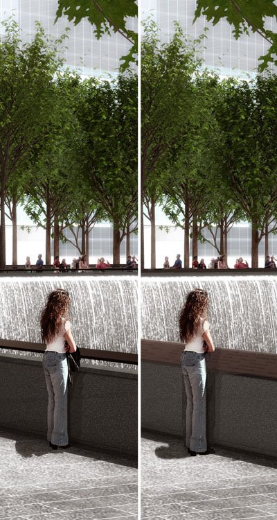
One of the biggest changes to the design is technically one of the smallest. Confused? Take a look at these images:

L-R: Before and After
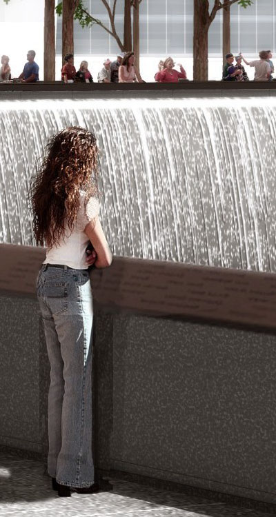
The only apparent change is that the floating handrail has become a solid cap for the parapet wall overlooking the waterfalls and voids below. But if we take a closer look, we see the function of this cap:

Yes, now the names of the dead that were previously etched into the walls below grade, adjacent to the waterfalls, are inscribed into this continuous railing atop the parapet wall. To me this does a few (not good) things: 1. It diminishes the role of the subterranean spaces to a visitor's center, galleries, and places for respite; 2. It diminishes the meaning of presenting the names of the dead via a "two birds with one stone" gesture; and 3. It makes the names an oversight for many visitors who will go to the edge to lean over and look at the waterfalls below (note how they didn't even change the woman in the rendering to reflect the functional change of this piece; she's not looking at the names, but the water below).
Driven mainly by construction exec. Frank Sciame, the full report on the redesign is available in PDF form on LMDC's web page.
One of the biggest changes to the design is technically one of the smallest. Confused? Take a look at these images:

L-R: Before and After
The only apparent change is that the floating handrail has become a solid cap for the parapet wall overlooking the waterfalls and voids below. But if we take a closer look, we see the function of this cap:

Yes, now the names of the dead that were previously etched into the walls below grade, adjacent to the waterfalls, are inscribed into this continuous railing atop the parapet wall. To me this does a few (not good) things: 1. It diminishes the role of the subterranean spaces to a visitor's center, galleries, and places for respite; 2. It diminishes the meaning of presenting the names of the dead via a "two birds with one stone" gesture; and 3. It makes the names an oversight for many visitors who will go to the edge to lean over and look at the waterfalls below (note how they didn't even change the woman in the rendering to reflect the functional change of this piece; she's not looking at the names, but the water below).
Driven mainly by construction exec. Frank Sciame, the full report on the redesign is available in PDF form on LMDC's web page.
ah, but they did change the rendering...
ReplyDeleteMaybe the new handrail is some sort of heating device, as it has apparently eliminated her need for a jacket.
They went to the trouble to smudge out an irrelevent element, but they couldn't be bothered to insert a more appropriate figure? Come on...at least make the effort to pretend this is a design improvement.
I didn't notice that. And looking at the close-up even closer, they did a pretty bad job of it.
ReplyDeleteThe fact that now the victim names are effectively at a typical viewer's groin height (if the figure in the image is to scale) is disrespectful and a poor outcome of "value engineeering".
ReplyDeleteValue Engineeering (or Value Management as it is called here in Australia) is just a euphemism for cost cutting with minimal consideration of design concept. Why not call a spade a spade?
Although the budget is hard to comprehend, I agree with Tropolism that the WTC Memorial has gone from "thrilling to tame".
is it just me, or does the whole point of the memorial seem to be escaping the grasp of everyone concerned, including the original designers? I mean, if this is one of the solutions they have towards saving the budget, then i fear what else has been value engineered. Let's face it...now, it seems more like a really, really big coin fountain.
ReplyDeleteit is a pity.
ReplyDeletethey should at the very least have made the entire parapet put of the same metal (?) material so the names would look like they are part of a wall and not just a railing. a sort of functional version of maya lin. still a bit stupid but better than engraving a hand rail with the names of the dead...
in the rendering it looks like one of those forgettable descriptions they put at viewing platforms describing what you are looking at in the distance...
Good point, anon. If the material is wood, the names will fade away w/ use.
ReplyDeleteEven in metal, the names will get scratched up.
This is a very disrespectful idea mixing something sacred with something functional.
It tells you how poor the designers are.
I'm sure the victims and there families will be very happy with the fucking value engineering.
ReplyDeleteExample:
Hey man, can you move a little bit so I can see the name of my dead father?
Pathetic.
i just hope by 'designers' you mean the LMDC, Sciame, Pataki, and Bloomberg....they are the ones responsible for this debacle.
ReplyDelete