Chang-Lin Tien Center
About 180 degrees from the Tate Modern Extension posted earlier today is UC Berkeley's Chang-Lin Tien Center, designed by Tod Williams Billie Tsien Architects. Yep, them.
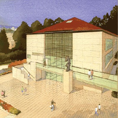
While it may not resemble other projects by the New York-based architects -- the Neurosciences Institute, the Folk Art Museum, the Cranbrook Natatorium -- it clearly exhibits their thoughtfulness and sensitivity to site, client, and program. And compared with the Herzog & de Meuron design for the Tate, this project is much more clear on what's happening inside.
(via Javlog)
does it matter that you understand what is going on inside? does it matter that you can predict the interior by looking at the exterior?
ReplyDeleteit is a personal thing, but i rather like the h and m project, and am less impressed by this project, which is after all quite standard fare, actually a lot like the work i used to do when i started out in architecture in the 90's. Not all architecture has to make a statement, or be radical, but the aspiration should still be to create inspiring spaces. this project looks, at least in the rendering, like a quite flat place to be.
Well, I was bringing up the legibility of the interior from the exterior as a way to compare and contrast the two projects, but since you ask it's not the most important quality for a design. At the same time it's not unimportant, especially in terms of its place in its context.
ReplyDeleteTo me, the HdM project, if built, will alter its context extremely, to the detriment of the existing Tate, even though HdM deny that. The rendering I added to the post even tries to play down its effect on its surroundings by mapping the adjacent buildings on the surfaces. This shows to me that they're aware of its hulking, super-busy massing.
On the other hand, the TWBTA design is perhaps too sensitive in its relationship to the UC Berkely campus. They were probably put in a situation that many architects are put in on campus buildings: design to match or don't build at all. But this is only one rendering, and having been in a few of their buildings, I have faith that what looks simple and flat (to you) will turn out to have more complexity and depth than what is apparent in that watercoloring.
One big difference between the two is that this project is currently under construction while the Tate addition is in its first stages, planned for completion in six years, meaning that design is far from "done".
As a postscript, I'm usually a HUGE fan of HdM, but this design just doesn't do it for me. Perhaps it will sink in and grow on me over time, but for now I can't help but think that they pushed the envelope as far as it could go and will have to tone it down from here, as the design undergoes cost estimates, approvals, and other parts of the process.
Let me preface this by saying that I am a huge fan of HdM and think they are one of the only starchitects out there today who are worth a damn. I wouldn't want to get kicked out of any architectural circles and have to turn in my black frames. However...some of the work has been getting a little self righteous latley...
ReplyDeleteFurther, I'm not a huge fan of the representationl style TWBTA choose (it actually suprises the hell out of me), but at the same time it is pretty much impossible to take either of these projects at face value based on a rendering or two.
The great thing abou TWBTA's work is the overt simplicity paired with astonishly suprising spatial qualities. I will say that the watercoler does little to evoke inspiration, but I'll give TWBTA the beinfit of the doubt. I'd be interested to see the outdoor space that bleeds off the right side of the image...looks a little like Neuroscience with different clothes on.
I think I would like the TWBTA project more if they got rid of the hip roof (a bit too residential) and added an interesting cornice to it w/ interlocking forms in their minimalist style. It it clean, but as John mentioned, it is also flat.
ReplyDeleteI am not ordinarily a HdM fan, and also have a visceral reaction to the form-making that has been popularized as of lately. To be quite honest, HdM is steadily approaching sculpture for living in. In contrast to most of these types of projects, in terms of proportion and translucency, I think they pulled it off like Nude Descending a Staircase...
However, is it functional, is it economical?
Maybe, as Todd and Billie were discussing the project one of them light heartedly proclaimed "Yeah, what this project needs is a hip roof" Someone obviously became confused and instead of drawing a roof that epitomized the latest trends in fashionable architecture they drew that instead.
ReplyDeleteThe hip roof appears so shallow in the rendering, so when somebody sees the building from the ground - as opposed to this aerial view - it might not be visible. Then it's all about the exterior wall and its stone surfacing.
ReplyDeleteGood point, John. It's all a matter of perspective.
ReplyDeleteSorry to take so long to add a few words on the Tsien Center. I am on the faculty of the UC Berkeley Department of Architecture and associated with the Institute for East Asian Studies, so I care deeply about this building.
ReplyDeleteWithout going into details, there is some helpful background. First, this buildings was designed for a site called Memorial Glade on our campus. For better or worse, the administration, in response to some hulking brutalist buildings built many years ago, insisted that any building on the glade have neo-classical overtones. Yep - Tod and Billie do not exactly spring to mind in that context, but have valiantly responded. The stone selected for the facade is apparently quite lovely, and having seen test patches for the exposed concrete, I am very excited about the sandblasted concrete finishes elsewhere in the building.
And if sandblasted concrete brings to mind the American Folkcraft Museum, it should - this building was designed around the same time, and just took a loooong (looooong) time to get funded. In fact, because of funding limitations, only the library will be built for the moment.
Finally, the rendering was done by the university for promotion purposes. Tod and Billie seem to (quietly) hate it - but clients are like that, you know? They do dumb things, and good architects grin and bear it, knowing the true test is in the building, not the eyewash.
Dana, Thanks for your insights, especially about the rendering. I seem to recall that Tod and Billie rarely, if ever, produce presentation materials (models, renderings). Maybe that's just a myth, but I've always taken it to mean they focus on materials, detailing, process, etc, rather than eyewash, as you put it.
ReplyDeleteSpeaking of materials, the attention that Tod and Billie give to materials in their built projects gives me hope that this one will turn out really well.
It looks like a Walgreens.
ReplyDelete