40 Bond Mock-up
The last couple days I was in New York registering for classes for the upcoming semester. With some time to spare I found myself in the East Village/NoHo area and walked along Bond Street to check on the progress of Herzog & de Meuron's development for Ian Schrager, 40 Bond Street.
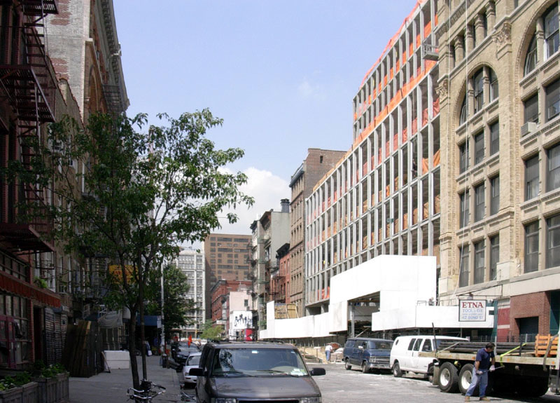
From a distance, the concrete-framed building looks very warehouse-like with a repetitive grid across the whole stepping facade.
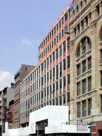
Getting a bit closer, I could see small pieces of the curved glass pieces that will cover the horizontal and vertical spans of concrete (visible just above the raised white box).
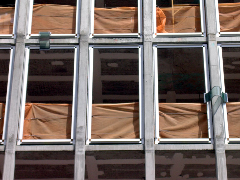
For those not familiar with the construction process, these two pieces are mock-ups in place for approval by the architect and client before fabrication of the skin by the manufacturer, a fairly typical procedure on jobs of this size.
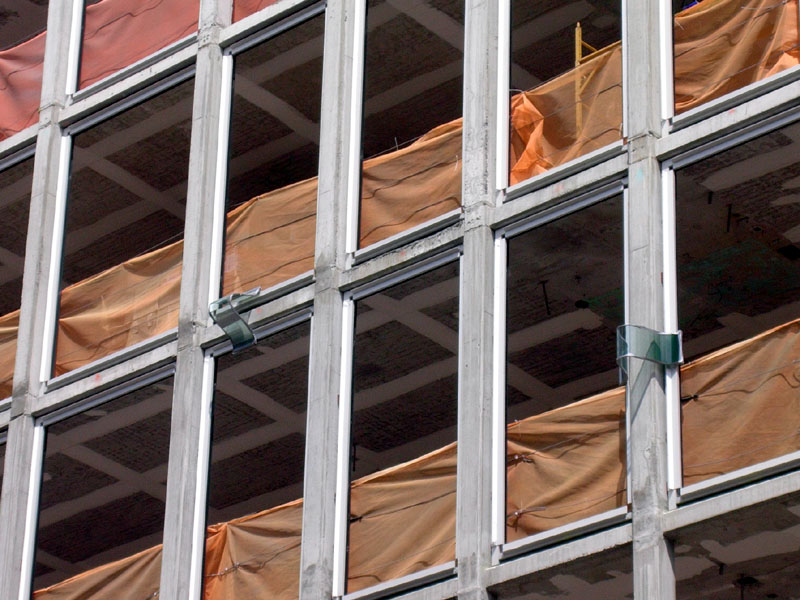
But to me these pieces seem too small to base a "yea" or "nay" judgment upon, especially in relation to the design intent.
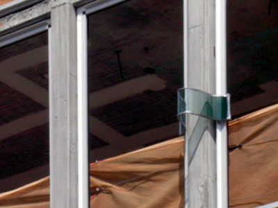
Regardless, it looks like a simple yet really cool way to enliven a pretty dumb concrete frame.
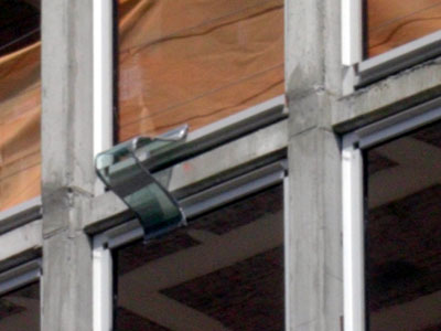
And it looks like somebody (most likely the local architect) addressed water infiltration, as it appears that gray strip on the underside of the curving glass is potentially some sort of drip edge and/or weep so water stays away from the window head.
I'll give the contractor some time before I head back and snap some photos of the exterior as it gets wrapped by this curving glass skin. Stay tuned.

From a distance, the concrete-framed building looks very warehouse-like with a repetitive grid across the whole stepping facade.

Getting a bit closer, I could see small pieces of the curved glass pieces that will cover the horizontal and vertical spans of concrete (visible just above the raised white box).

For those not familiar with the construction process, these two pieces are mock-ups in place for approval by the architect and client before fabrication of the skin by the manufacturer, a fairly typical procedure on jobs of this size.

But to me these pieces seem too small to base a "yea" or "nay" judgment upon, especially in relation to the design intent.

Regardless, it looks like a simple yet really cool way to enliven a pretty dumb concrete frame.

And it looks like somebody (most likely the local architect) addressed water infiltration, as it appears that gray strip on the underside of the curving glass is potentially some sort of drip edge and/or weep so water stays away from the window head.
I'll give the contractor some time before I head back and snap some photos of the exterior as it gets wrapped by this curving glass skin. Stay tuned.
Heaven forfend that they pay lip service to the buildings on either side of it. As we used to say downtown 30+ years ago- Soho sucks, bring back the trucks.
ReplyDeleteRFS said...
ReplyDeleteHerzog & de Meuron are definetly the most innovative architects these days!!! Looking forward on going to NY to see that.
I'd like to see that.
ReplyDeleteWhat I would really like to see is that bookcase shown in the fourth picture on Triple Mint's page. What a wonderful wraparound, nearly genious. Well, okay, genious compared to me...
(I've completed my first week in what will be 6 years of Architecture school. Go me?!)
I think its gonna look pretty cool if the curved glass is going to frame the entire concrete. Would love to see some other interior and exterior work doen by these architects.
ReplyDeleteyes, genius wraparound shelving just don't break your neck reaching for books in the middle. staircase is cool though.
ReplyDeletewonder what the intersection of verticals and horizontals will look like. that's going to be some nice groin vault of glass!
ReplyDelete