Half Dose #73: Leaf House
The following text and images are courtesy Undercurrent Architects for their Leaf House in Sydney, Australia. The firm's Palmwood House in London was featured previously on my weekly page. Photographs below are by Hugh Rutherford.
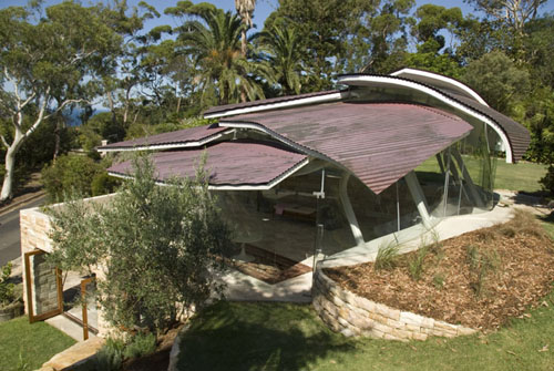
Leaf House is building that allows users to be inside and in-the-garden at the same time. Located on an escarpment overlooking the Pacific Ocean, between rugged native bush and manicured garden, the building is a self contained cottage forming part of a private residence, consisting of a canopy roof over a stone podium and glass enclosed deck.
The site is viewed and experienced in the round; from all sides, above and below. The building design is therefore unique from every aspect, constantly changing as it is moved in and around.
From the house above, the building nestles within the tree line; a series of draped copper roofs reflecting the silhouette of a nearby headland & blending with surrounding foliage. The roof is shaped to minimize bulk while maximizing internal volume, a diffuse layering of curved steel panels combining roof with wall. The roof is articulated to provide visual interest from above, reflecting the stepped terracing of the terrain and softening the form and scale of the building. The building outline is further broken up by corrugated surfaces shifting geometry between layers, referencing background ocean patterns.
At garden level, the terrain unfolds below the canopy roof and is shaped as it passes through the building. Traverse views are formed connecting different parts of the garden, blending the interior with the landscape around it. The roof cascades in line with the hill, focusing views towards the beach and forming deep awnings for solar control. Gaps between roof layers open up, permitting light and views to filtrate the interior.
Three retaining terraces define the podium base: an upper level entry, a partially submerged main deck and an excavated lower level. On the main deck level, the interior is open to the garden. An enclosure of molded glass forms an undulating wall, softening views and reflections especially when illuminated at night. Daylight filters through the porous roof canopy into open plan living, kitchen and dining areas, bordered by a balcony and sun deck.
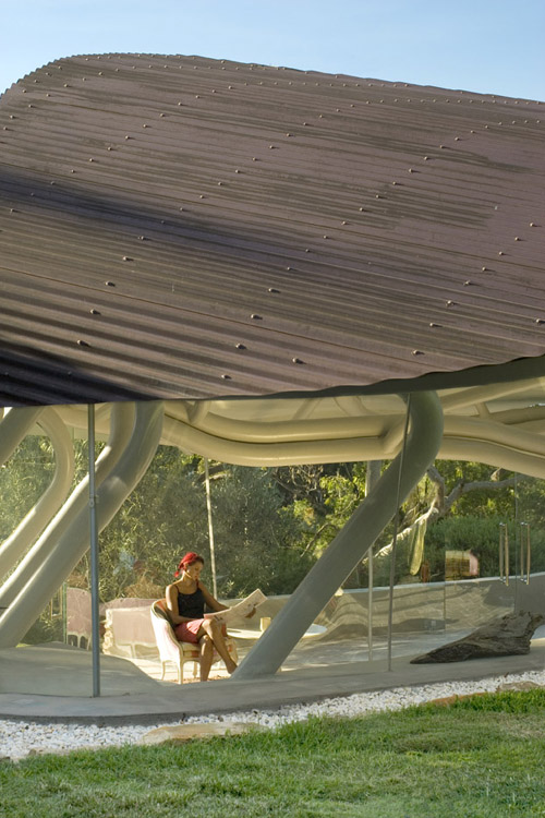
Structural support for the roof is a woven and interdependent system of curved beams and columns, working in conjunction with the stressed-skin roof panels. The structure resonates with the energy of garden growth, bringing a sense of sponginess to underline the porous nature of the roof. Towards the ocean, the structure is bunched into a single load point, releasing panoramic views and freeing the perimeter. Uphill, it is stabilized by a spread of six inclined columns, driven to ground like heavy rain. Entry at the upper level provides an elevated perspective within the canopy space.
The lower level is excavated into the terrain, partially protruding from the hill to capture light and views. It acts a thermal sink counterbalancing the more exposed upper levels, and contains introspective rooms such as library, bedroom and private living area. A stair void carries light and air into underground areas.
The project entailed design and building roles as methods were improvised to achieve high technical complexity within cost constraints. Complex steel and glass forms were produced from standardized templates: glass being formed from 1 mold, flipped rotated and inverted to get apparent variations from a repetitive shape; roof panels derived from 2 templates with variable edges; beams to a series of set radii. Steel fabrication used industrial boat building methods with broad tolerances, so the structure was rapid to make, albeit with a rougher, handmade quality rather than sharp precision normally associated with building steel. This limited site work to rapid assembly of big parts, controlling costs and contractual works so that tasks were managed by a small team.


What a dream house!
ReplyDeleteThe video is fascinating.
This is a very fascinating structure. I love how it's all steel and glass - typically most organic structures these days are concrete. It's refreshing to seeing something that looks and feels so light and airy. It starts me thinking - could something like this be done in wood, with the same feel?
ReplyDeleteIn the photo of the woman sitting inside the structure, she looks dwarfed by the scale of the columns and roof.
ReplyDeleteIt might make a nice hotel lobby.
I think the concept is too literal. It seems more like an oversized sculpture than a building fit for living in. Theres a place for organic interpretation in architecture but this is just crass.
ReplyDeletei agree with adam, this is on the silly side, unless the roof's leaf shapes and their "stems" were useful somehow. if the columns contained wiring or aided in cooling the place, for example.
ReplyDeleteEnric Miralles.
ReplyDelete1993.
http://www.mirallestagliabue.com/project.asp?id=66
I think Adam and Lupe would appreciate the architecture if there is more green color in the Leaf House. But for me, the house is fine. It just needs more color to add some life. Like our clan's homes in Broken Arrows. With lively colors the architecture is more admirable and livelier to look at. Realestate (Tulsa, Oklahoma) in subdivisions boom because of the inviting colors of the houses that attracts the buyers. I guess this house also should have some colors to make the house more appealing to other people.
ReplyDeleteKatie, I agree with you colour (excuse the spelling I am Canadian) is a great way to make things livelier. However in this case Adam and Lupe have an issue with how literal the project mimics nature. I tend to agree that that the fantasy world is clashing with domestic life here.
Delete