Formique
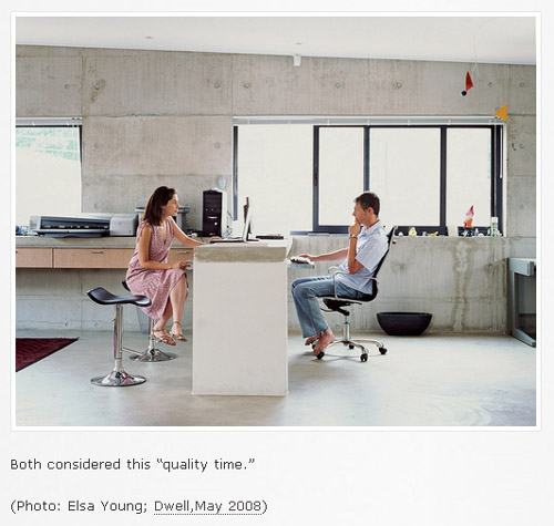
Unless you've been living sans internet for the last few weeks, you've probably seen Unhappy Hipsters. Last week I added a link to the site that features photos from Dwell Magazine with some droll and usually spot-on commentary as a caption. The heavily re-tweeted and e-mailed web page lightly critiques both the architecture, the inhabitants and the means of expression Dwell uses to convey their particular "brand" of neo-modern residential design.
[Unhappy Hipsters | image source]
Well, those Unhappy Hipsters make me wonder why a similar blog does not address the out-of-control formalism in architecture today, the because-we-can designs that seem to ignore some of the basic human, environmental and other concerns that architecture should address, all in the name of formal invention. Architectural Record's The First Word blog comes pretty close, but its format of providing a definition and commentary based on a single image is uncritical in its look at new buildings and projects. I think what is needed is something that addresses the things missing in architecture today, because it's so easy to be wooed by pretty pictures -- carefully composed and modified photographs or ever more realistic renderings -- that gloss over a design's shortcomings, especially when they're accompanied by the architect's own words on blogs like Arch Daily. And given that just about all projects today are accompanied by both types of images, it's harder and harder to determine what is successful without being able to visit a building in person.
That said, I figured why not just launch another series on this blog that could tackle such a thing? Yes, I've been slacking on some of the other series (firm faces, especially), but this one sounds like a fun one to tackle. I won't try to replicate the Unhappy Hipster's wit, instead I'll just use architectural imagery as a launching board for commentaries in my usual unexciting tone. Like this:
[Kiltro House in Talca, Chile by Supersudaka | image from Arch Daily]
The architects describe how the wooden envelope blocks Chile's hot summer sun, but the roof terrace -- the principal facade when arriving to the house, they also explain -- is completely open to the sun and other elements, any time of year. Accessible but unusable, towards preserving the seamless wrapping of the wood envelope from the entry to the roof and the minimal appearance of this top surface on the approach.


I was JUST talking abut this with someone!
ReplyDeleteObviously brilliant idea. Great minds think a like and all.
Hi good points but some of the best architecture arose as a result of disasters as I found at http://myamazingpeople.com/
ReplyDeleteThe roof terrace in the house in Chile could be used in the night to watch the stars, most of the rain there happens only in 4 months, the other 8 have very little rain. The wood structure can absorve heat during the day to help with the cold night of that region
ReplyDelete