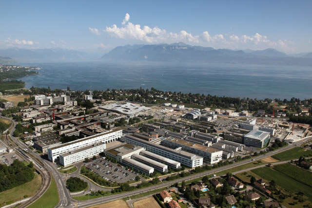
Featured a few years ago in project form, the
Rolex Learning Center by SANAA is now complete and opens on February 22 in Lausanne, Switzerland. Back then I discussed the design in terms of the trend of "Swiss cheese architecture," probably unrelated to the building's location but nevertheless found in a number of building designs by SANAA and other architects.
 |
| [Rolex Learning Center within the EPFL campus / ©EPFL/Alain Herzog] |
One aspect of the Rolex Learning Center which sets it apart from other horizontal buildings punctuated by round or elliptical courtyards (see
Burr Elementary School by SOM) is the building section, the way the slice of cheese undulates along the ground's flat plane. In a sense the building becomes the landscape; instead of cutting and filling the earth to provide access underneath, the building rises and falls to accomplish the same.
 |
| [Rolex Learning Center / EPFL / SANAA / ©Hisao Suzuki] |
So to what end does the undulating cheese building accomplish? It allows movement across the site without entering the building. It creates a unique topography and experience inside for visitors. And it creates a distinctive appearance for the building, especially on end, where one can see the building's elevation curve.
 |
| [Rolex Learning Center / EPFL / SANAA / ©Hisao Suzuki] |
What most intrigues me are the in-between spaces underneath the building's "bridges." These highly compressed spaces, finished in raw concrete, have potential in terms of programming (performances, exhibitions, gatherings), though at the moment the outdoor spaces are envisioned as places of relaxation.
 |
| [Rolex Learning Center / EPFL / SANAA / ©Hisao Suzuki] |
The program of the Learning Center currently includes a scientific library with study areas, the CRAFT Laboratory -- a research center for EPFL (Ecole Polytechnique Fédérale de Lausanne) -- and the Rolex Forum -- an ampitheater with stage for 600 people -- and dining spaces. With these aims and programming, it sounds like the only spaces open to the public are the exterior spaces under the building and within the courtyard. If this is the case, the undulations seem justified. Without them the student and research facility would be a walled-off, impenetrable mass.
 |
| [Rolex Learning Center / EPFL / SANAA / ©Hisao Suzuki] |
Nevertheless this condition (no interior public space) is unfortunate, because the interior spaces appear quite striking, in their empty state at least. They seem like diagrams for flows of information, unimpeded by walls and right angles. Perhaps a metaphor for the sharing of data that is important with scientific research?
 |
| [Rolex Learning Center / EPFL / SANAA / ©Hisao Suzuki] |
One design feature I question is why the roof parallels the floor. Maybe it was cheaper to reuse the formwork; after pouring the floor the forms could be raised for the roof. As well this makes the glass and its framing a consistent height, cheaper and easier to fabricate. Regardless, having the two slabs parallel means that the space is undulating but uniform. But if the roof plane did it's own thing -- maybe flat, or undulating in a different direction -- then the spaces would have further tension and compression, even more variety and diversity. As is it's still a remarkable building that transcends its Swiss-cheeseness.


While I am always impressed by SANAA's use of subtle form, but bold execution, I am left with one nagging practical question. How do you place furniture in a space that does not have a flat surface?
ReplyDeleteIn the two middle photos, both outside looking in, you can see seating on one of the curved "bridges" and what looks like library stacks on the right side of the dusk shot. I'm guessing the latter is on a relatively flat surface, though even OMA's spiral stacks in Seattle show that stacks can be accommodated on sloping floors.
ReplyDeleteI'm guessing chairs and other furniture won't have casters. But I can see students and researchers using roller skates to get around!
@C: seems a lot of people think the same about SANAA's work, including me... model architecture that doesn't handle so well translation to real world and human scale...
ReplyDeleteIts remarkable how slender the supporting columns are. An exciting building.
ReplyDeleteThe sloping floors don't really bother me because its a work space, a space for doing.
I don't think it would be appropriate for a domestic space.
I'm remembering now Steven Holl's entry to the Gedenbibliothek competition for Berlin. He used a giant inhabitable bow truss for the children's library, which allowed the kids to lounge on an angle while reading. Like a building-size chaisse.
ReplyDeleteI think its a very bold approach towards architecture in terms of casting parallel floor and slab.lets take in this way i think if i am pursuing my schooling in this space it will be a experience as as every new day i will be exploring a new dimension of the space.(good or bad optional) but learning some thing more...
ReplyDeleteThis comment has been removed by the author.
ReplyDeletewatch these movies to get a feeling for the interior use
ReplyDeletehttp://www.youtube.com/user/RolexLearningCenter#p/u/0/4O0OqdIoOPQ
http://www.tsr.ch/tsr/index.html?siteSect=500000&channel=info#program=15;vid=11815295
absolutely wonderful
ReplyDeleteonce again outstanding, x
ReplyDeleteThe architect must have been on some serious drugs, but thank heavens for that. This building is absolutely the most unique thing I have ever seen. Could you imagine riding a bike around this place.... sweet..
ReplyDeleteBrian T. Stratton | New Jersey Landscape Architect and Designer NJ
Brian T. Stratton | New Jersey Landscape Architect and Designer NJ
I'll never question their taste for uniqueness, they're doing innovative works on Rolex watches so they're just doing it on their buildings. Its still the same!
ReplyDeleteSelling Rolex
I wonder,
ReplyDeleteHas anyone of the architects, ever heard of the landscape designer "Piet Oudolf" ? Hiis design should perfectly fit and finish this wonderful duilding. And will make a logical connection with the surrounding elements.