Book Review: thawed
thawed by the School of Architecture and Graphic Design Departments at the University of Illinois, Prof. Stewart Hicks, Architecture; Prof. Jimmy Luu, Art + Design

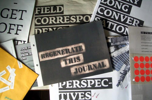
At a time when the iPad and ensuing offshoots point the way to the digitization of periodicals, it may be odd to see a new student publication focused squarely on print. But that's what the University of Illinois at Urbana-Champaign's School of Architecture and Graphic Design Department started in 2008 with thawed, the first annual arriving in the fall of 2009. As can be seen in the images above and below, this ain't your daddy's student journal, it is a hodge-podge of printed media: poster, stickers, pamphlets, booklets, newsprint, even laser-cut chip board and balsa. It would be absurd to tell the students and professors at U of I that they should just put thawed on the web; it's just too varied and centered on exploiting the potential of print to warrant such a suggestion.

As their web page indicates, thawed "is in pieces. It comes to you as a collection of multiple pamphlets, objects, and posters (below) that can be viewed together as a unit, or distributed in individual pieces. There is no correct order; there are only reconfigurable variations." In fact the different parts are close to impossible to flip through without taking them apart; the thick chip board piece precluded the preservation of order. This interactivity is impossible in the digital realm, even though that term is certainly a popular description for the internet. Here interactivity doesn't necessarily change the content (though one could do that with markers, for example, and the stickers that accompany one of the artifacts in this first issue) but it enables the whole to be reconfigured. A static journal implies importance and other qualities through ordering, though thawed breaks that down, letting each piece of content speak for itself apart from the rest. The primary means of consistency are the name "thawed" stamped onto each piece and some typography that is repeated.

One reason for choosing print over bytes may be the atypical collaboration between the architecture and graphic design departments. Instead of having one serve the other (graphic designers merely presenting the architecture student's projects) the two simultaneously work together and separately. Certain pieces are standalone artifacts that appear to be the product of one individual, while other parts exhibit a strong symbiosis. The latter can be seen in an analysis of student architecture journals in the United States (below), where a number of variables (geography, type of content, visual design, and audience) describe how design and the architectural content relate. While having edited one of the journals in the grid (Oz) makes me partial to this sort of content, there is readily apparent a desire to situate thawed in relation to other journals of its ilk, to set it apart from its peers.

thawed's content includes: "Field Correspondence: a reaction from the "field" [that] includes curated submissions from students and faculty at the University in the form of notes, essays, and objects. A Very Long Conversation: extends or responds to themes explored by earlier publications of the University, while at the same time, sparking new talking points for design culture in the Midwest. It is intended to be a continuous stream of 'conversation' between each issue of the journal." See the call for submissions for issue two.

At a time when the iPad and ensuing offshoots point the way to the digitization of periodicals, it may be odd to see a new student publication focused squarely on print. But that's what the University of Illinois at Urbana-Champaign's School of Architecture and Graphic Design Department started in 2008 with thawed, the first annual arriving in the fall of 2009. As can be seen in the images above and below, this ain't your daddy's student journal, it is a hodge-podge of printed media: poster, stickers, pamphlets, booklets, newsprint, even laser-cut chip board and balsa. It would be absurd to tell the students and professors at U of I that they should just put thawed on the web; it's just too varied and centered on exploiting the potential of print to warrant such a suggestion.

As their web page indicates, thawed "is in pieces. It comes to you as a collection of multiple pamphlets, objects, and posters (below) that can be viewed together as a unit, or distributed in individual pieces. There is no correct order; there are only reconfigurable variations." In fact the different parts are close to impossible to flip through without taking them apart; the thick chip board piece precluded the preservation of order. This interactivity is impossible in the digital realm, even though that term is certainly a popular description for the internet. Here interactivity doesn't necessarily change the content (though one could do that with markers, for example, and the stickers that accompany one of the artifacts in this first issue) but it enables the whole to be reconfigured. A static journal implies importance and other qualities through ordering, though thawed breaks that down, letting each piece of content speak for itself apart from the rest. The primary means of consistency are the name "thawed" stamped onto each piece and some typography that is repeated.

One reason for choosing print over bytes may be the atypical collaboration between the architecture and graphic design departments. Instead of having one serve the other (graphic designers merely presenting the architecture student's projects) the two simultaneously work together and separately. Certain pieces are standalone artifacts that appear to be the product of one individual, while other parts exhibit a strong symbiosis. The latter can be seen in an analysis of student architecture journals in the United States (below), where a number of variables (geography, type of content, visual design, and audience) describe how design and the architectural content relate. While having edited one of the journals in the grid (Oz) makes me partial to this sort of content, there is readily apparent a desire to situate thawed in relation to other journals of its ilk, to set it apart from its peers.

thawed's content includes: "Field Correspondence: a reaction from the "field" [that] includes curated submissions from students and faculty at the University in the form of notes, essays, and objects. A Very Long Conversation: extends or responds to themes explored by earlier publications of the University, while at the same time, sparking new talking points for design culture in the Midwest. It is intended to be a continuous stream of 'conversation' between each issue of the journal." See the call for submissions for issue two.
Comments
Post a Comment
Comments are moderated for spam.