Learning From the Weekender
Many people are familiar with the current MTA Subway Map (PDF link) designed by Michael Hertz Associates in 1979 with modifications in 2010:
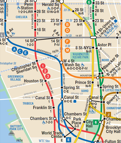
But fewer people are probably familiar with the subway map designed by Massimo Vignelli in 1972 (a redesign of a map by George Salomon), used by the MTA until its successor seven years later. More people should be seeing Vignelli's design with the MTA's use of an updated version (from 2008/10, with Beatriz Cifuentes and Yoshi Waterhouse) for The Weekender, which graphically describes the system's weekend construction:
As can be seen in quick comparison of the two maps, Vignelli treats each line as its own conduit, rather than lumping each numbered or lettered line with its respective single-line color. This makes it suitable for The Weekender, so then each line can be shown if it is running or not over the weekend (in the above excerpt the B and M lines for example, are faded to indicate they don't run), and blinking dots can signal that work is planned. It's an effective design for this purpose, and it is interesting to see an old design resurrected decades later.
As a side note, me calling the lines in the Vignelli map conduits is intentional, as the design reminds me of the cover of Reyner Banham's 1969 book The Architecture of the Well-tempered Environment:
Banham's book "assesses the impact of environmental engineering on the design of buildings." What better illustration of that account than abstract ducts or conduit? In each case paths of movement are simplified and color coded (though Banham's graphic probably doesn't relate to a particular building), such that what they carry -- people, air, electricity, etc. -- is irrelevant, as is the actual path of travel (Vignelli's angles hardly follow the real paths). What is important is the location of the nodes and the beginning and end points, as well as if and how the paths overlap. (I wonder if the stacking of lines in Vignelli's map -- red above blue in the above, for example -- relates to reality, in terms of where the tunnels are located below ground.) As I see more and more confusing diagrams, like the one below from The Function of Form drawing relationships between A and B, Vignelli's map offers a means of making sense of complex connections.


Comments
Post a Comment
Comments are moderated for spam.