AE26: Squeezeboxes
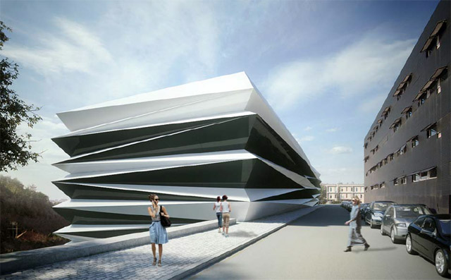
Today a press release from Portuguese office AND-RÉ about their new BIOMED Research Center in Coimbra landed in my inbox. Here's a view of the design:
[BIOMED Research Center by AND-RÉ | image courtesy the architects]
The renderings reminded me of a project from Trahan Architects, the River Center Library (2010):
[River Center Library by Trahan Architects | image source]
These designs are what I'm calling Squeezeboxes. Unlike exteriors that are serrated in one direction (here's an example), these work in two directions: angling towards the corners at top and pinched near the middle in the above. Another project, 11-19 Monument Street by Make Architects (2006), is oriented vertically, but the same angular lines are apparent.
[11-19 Monument Street by Make Architects | image source]
Of course, calling something a Squeezebox begs movement. Perhaps the Tango series by Victor Enrich, which implies movement through various images, could someday be a reality. The architecture may be mundane, but the imagined transformation is much more radical than the above buildings...though it's more Slinky than Squeezebox.
[L-R: Tango 1, Tango 3, Tango 4 by Victor Enrich Photography | image source]


Comments
Post a Comment
Comments are moderated for spam.