MCA Denver

Museum of Contemporary Art Denver in Denver, Colorado, by David Adjaye Associates, 2007
They say that a book should not be judged by its cover. The same sentiment should surely be applied to architecture, since what a building presents to the street—its facade—is never a totally accurate depiction of what is happening inside. This pertains to traditional buildings as well as modern architecture, but it is particularly pronounced in the case of the latter, particularly all-glass exteriors that reflect the surroundings rather than giving a peek inside. A building where this is pronounced especially is David Adjaye's competition-winning design for the MCA Denver. What looks like a simple glass box at first glance is fairly complex in three places: the back of the building, the interior, and the rooftop.
On approach to the building, a Cor-ten clad mass detached from the museum on one side draws one's attention. The house is also designed by Adjaye (the LN House on his website) and works on a similar premise while also being quite different; namely, its skin is flat and taut but the rust has a much different sensation than the glass. The lane between the two buildings leads to more residences that cater to the popularity of the adjacent LoDo District (Lower Downtown) as well as the museum itself. Cantilevering over the lane is a wood box in the far corner of the museum, something that looks a little precarious and has a strong presence; but it's a total surprise, nowhere to be seen when approaching the building.
Walking back to the intersection to enter the museum, one gets a close look at the exterior glass walls. They are dark but are translucent, as if they are painted on the interior or have curtains behind them. What is actually going on is revealed when ascending the ramp from the corner to the entrance (below). Behind the glass is a layer of translucent plastic (Monopan, to be precise) that insulates the interior spaces while softening the light that enters the galleries. Adjaye used the material before in the studio/residence he designed for two artists in Brooklyn, where it is used as an outer skin and silkscreened to take on a dark appearance.
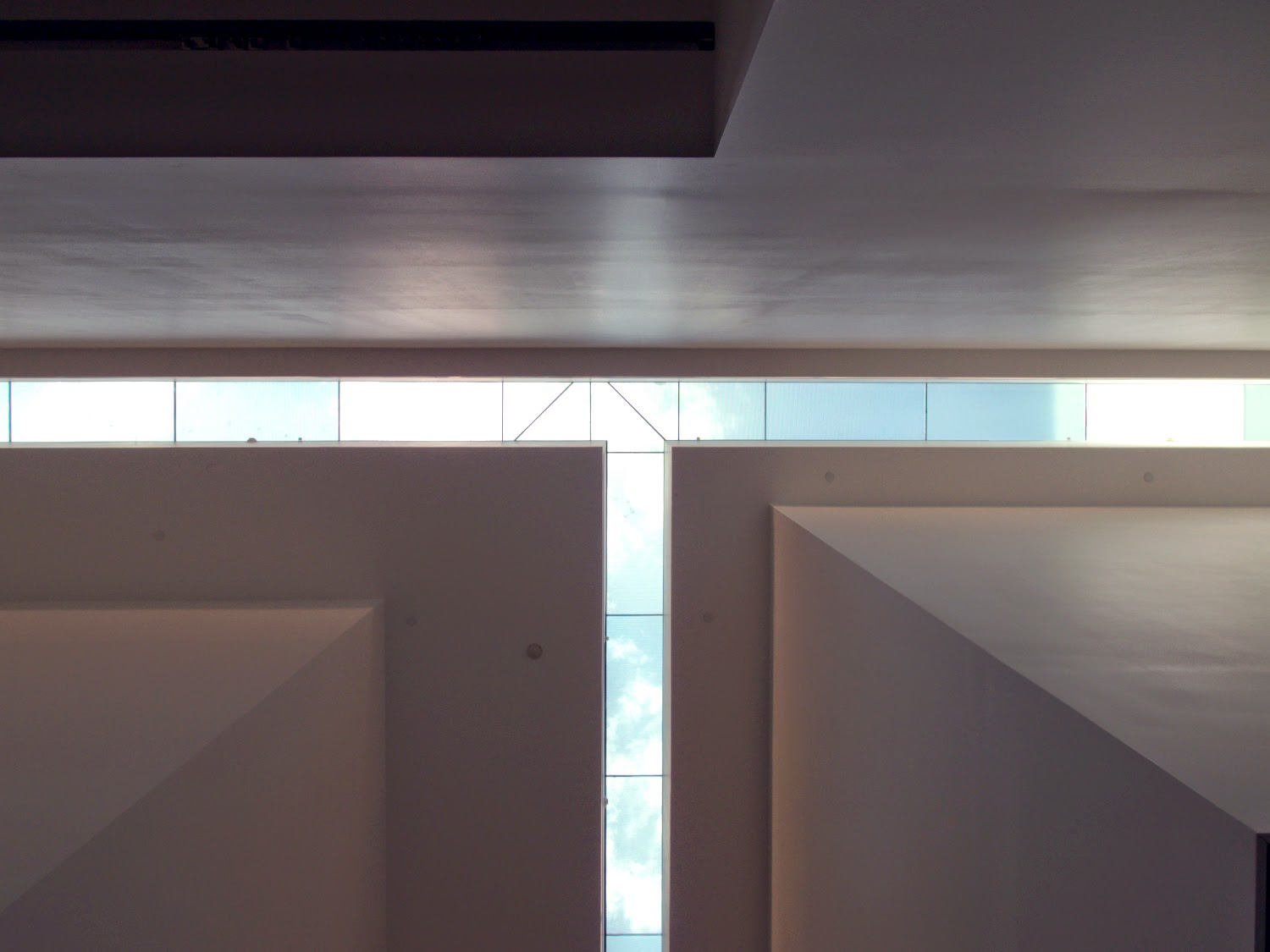
The heart of the building is a full-height, T-shaped space capped by two linear skylights. While the glass-box exterior gives the impression that the building, like office buildings with similar wrappers, is made up of pancake slabs behind the exterior skin, the institutional program allows some flexibility. Turning the 180-degrees from entrance ramp, through sliding glass door, and around the ticket counter, the atrium space came as quite a surprise. Given how the translucent panels eliminate direct sunlight entering galleries, the atrium space is a means of defining the locations of the galleries, creating a center within the museum, bringing natural light to the center of the building, and orienting visitors as they move through the spaces.
Where the circulation on the ground floor happens below the T-shaped skylights, on the second floor the circulation is pushed to the perimeter, with galleries sitting roughly in the middle of the plan (three galleries on the other side of the atrium walls). The circulation on both floors, combined with the stairs connecting the two (and the roof) adds up to a good chunk of the building's 25,000-sf area. Since the MCA Denver is not a collecting institution, it can be a little loose in the ratio of functional space to circulation.
The first and last of the three surprises are found on the roof. A hint of something happening on the roof can be glimpsed from across the street (top photo) but, like the cantilevered box seen from the lane below, it's not until walking up to the roof that they are fully grasped. Inside the wooden box is a lounging area that is more art than furniture, and out on the roof deck are planters, a cafe, and a variety of places for sitting and taking in views of Denver.


Comments
Post a Comment
Comments are moderated for spam.