A Visit to the 9/11 Museum, Part 1
On opening day, May 21, I visited the 9/11 Memorial Museum in Lower Manhattan. I snapped lots of photos and spent a few hours there, much longer than I anticipated. Therefore, photos and impressions from that visit are split into two posts: Part 1 is the pavilion, designed by Snøhetta, and Part 2 is the below-grade museum, designed by Davis Brody Bond.
[All photos by John Hill]
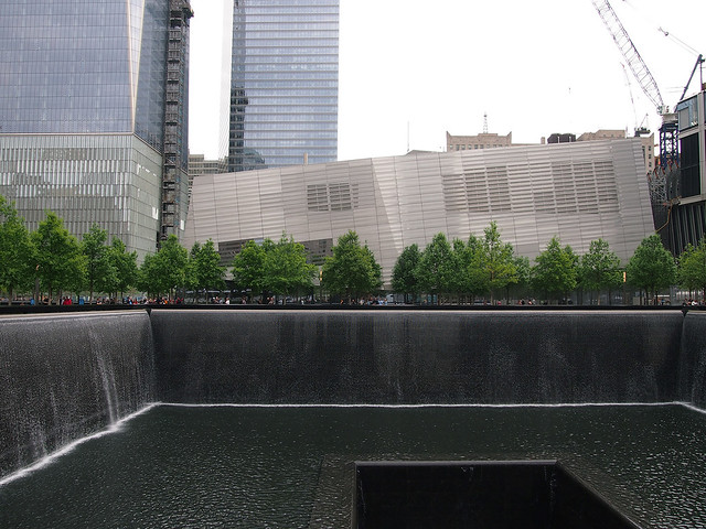
Even before stepping foot inside the pavilion on opening day, the changes at the World Trade Center site are obvious. Instead of getting a timed ticket and going through airport-like security to access the memorial, with its twin pools and grove of trees designed by Michael Arad and Peter Walker respectively, the perimeter of the site is partly open at its perimeter to allow unencumbered access to the memorial. While this situation allows the memorial to be more integrated into its Lower Manhattan surroundings, the ticketing and security screening are shifted to the museum proper.
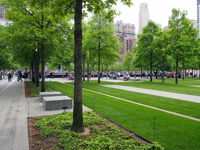
Unlike the below-grade museum, New Yorkers and other visitors to the city have had time to get acclimated to Snøhetta's jagged, glass-and-metal entry pavilion, what is really the only element on the 16-acre site reminiscent of Daniel Libeskind's winning master plan entry.
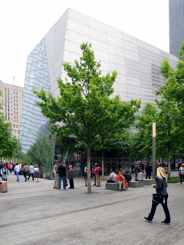
Yet even with a good deal of glass facing the memorial pools, the pavilion reflects the surroundings during the day, forcing people to press their noses against the glass to attempt to see what's inside (something that Snøhetta's Craig Dykers has repeatedly said in articles as liking).
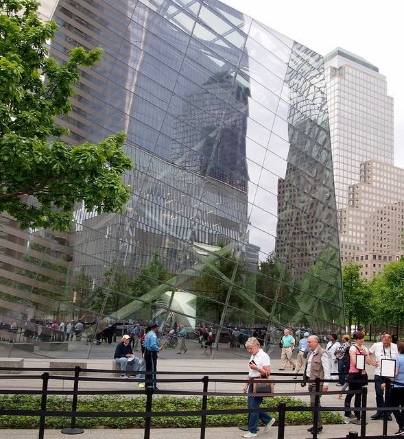
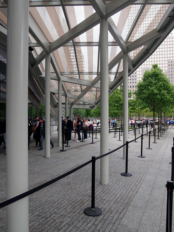
The entrance to the museum is located on the north side of the pavilion, where the crowd control starts. My ticket is set for 10am, and while the ropes portend a long wait, the walk through them and the security screening in the lobby is speedy and much less stressful than the similar custom of trying to catch a plane.
Once through the security lobby at the east end of the pavilion, one's direction and gaze is shifted westward, toward the glass corner, the rusty tridents from the Twin Towers, and the memorial beyond. The glazing, view and artifact from the original World Trade Center combine to create a strong draw, first to the west and then down into the darkness of the museum.
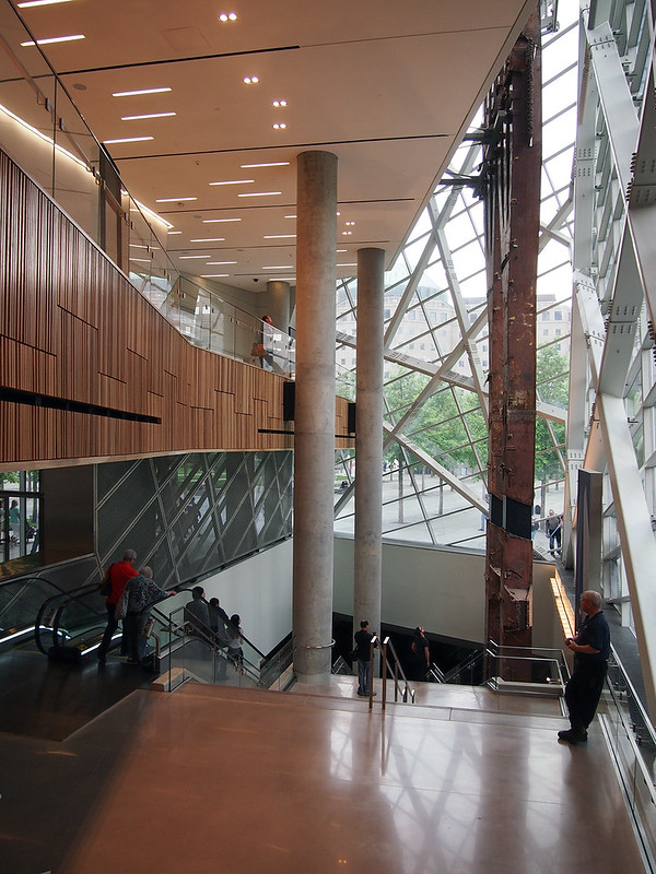
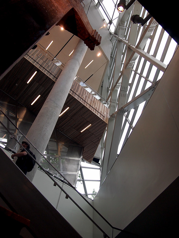
But the wood slats covering the mezzanine's spandrel (the most overtly Scandinavian part of the design) and the wood steps rising to the east offer the visitor the option of ascending rather than descending. Upstairs are bathrooms, a cafe, and an auditorium showing a 10-minute film with (I hear, as I didn't watch it on my visit) politicians and others speaking about their roles and reactions on September 11, 2001.
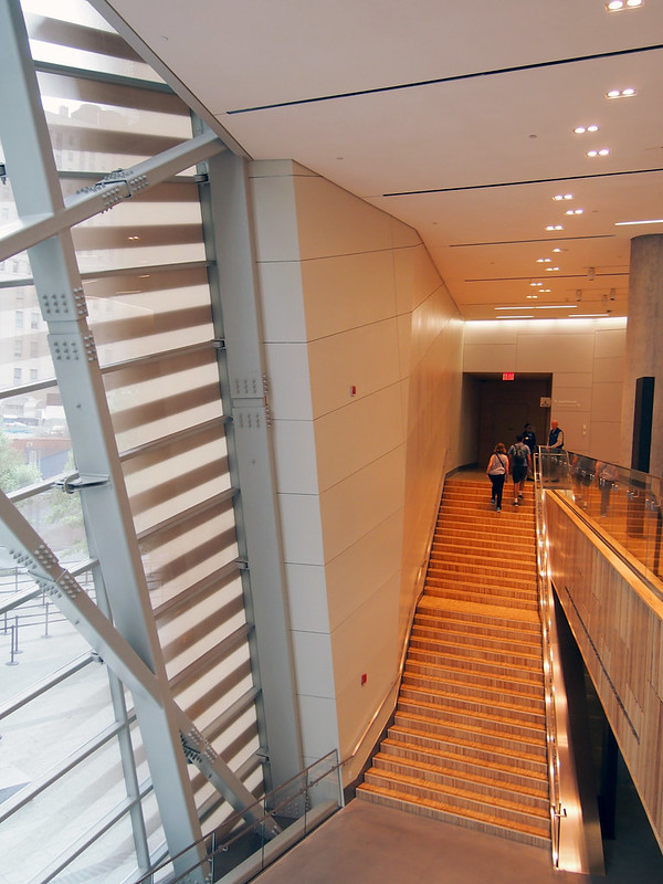
I observe that most people walk down rather than up, but I head up the stairs to get a vantage of the corner from the mezzanine:
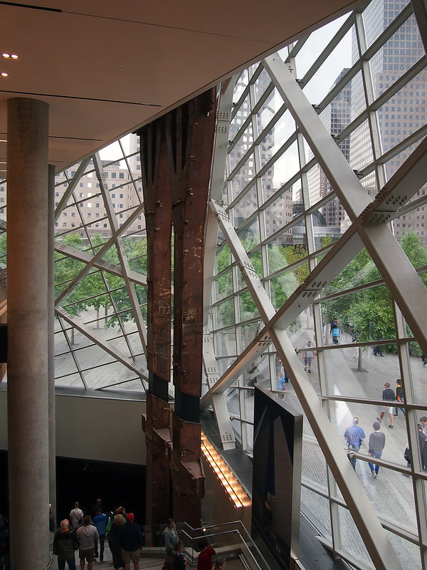
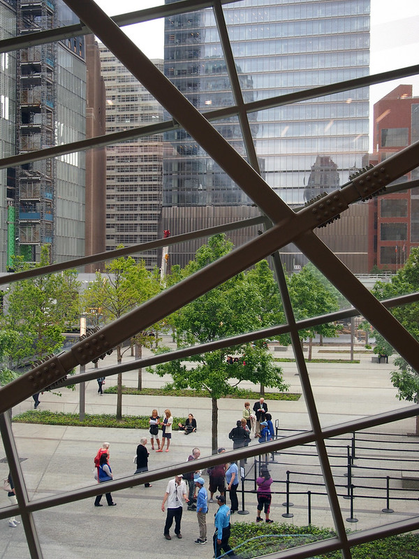
From this level, Snøhetta's angles clearly counter the gridded horizontals and verticals of the surrounding buildings:
But after a few minutes looking out the glass and reading a sign about the Twin Towers tridents – also overhearing the barista telling a customer in the corner cafe (visible at the end of the mezzanine in the below photo) that they don't take tips – it's time to descend from the pavilion's high point to the underground museum.
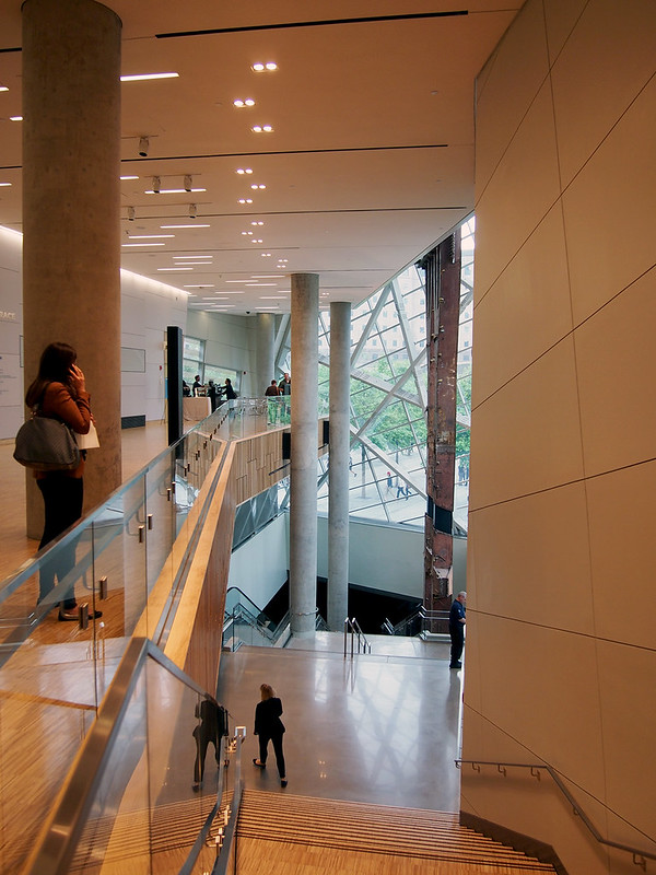
Each step that one takes down the stairs (or each second the escalator descends), the darkness of the underground museum becomes larger...
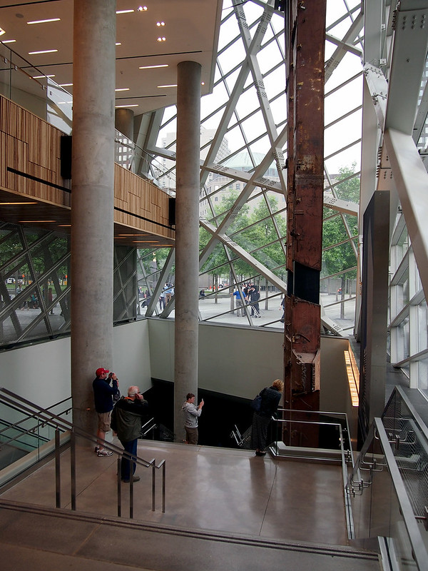
And larger...
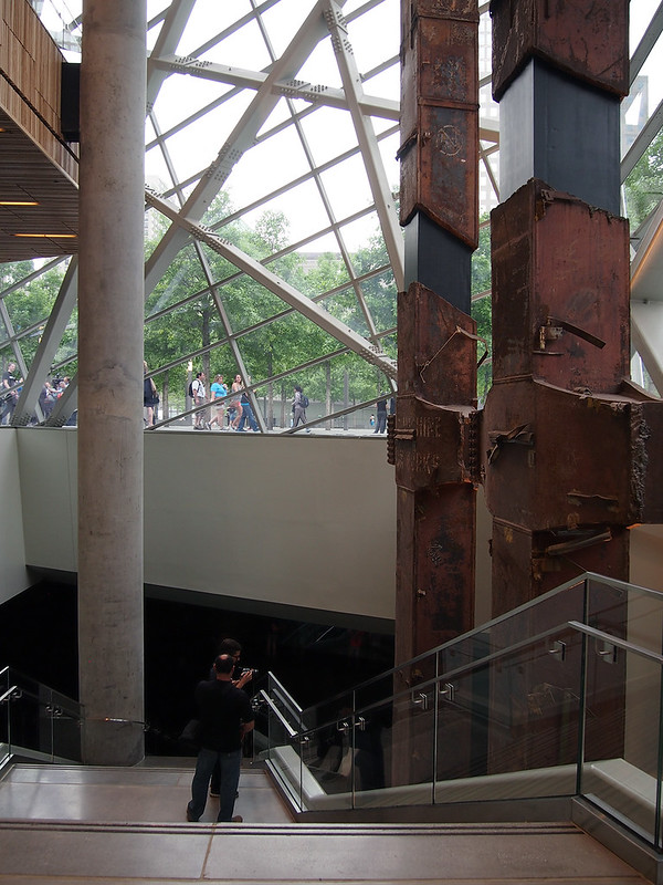
But before being enveloped by the dark, it is necessary to stop and snap what will likely become (if not already) the most photographed sight within the 9/11 Memorial Museum: looking up at the tridents with 1WTC beyond:
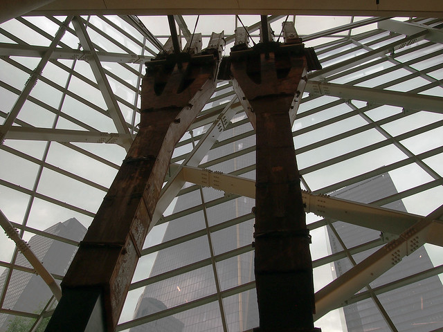
The tridents do many things in their current context: Physically, they anchor an important corner of the pavilion; they are an immediate reminder of what stood on the site until 2001; and they reach down to the lobby level of the museum, in effect bridging the above and below realms and leading us down into the literal and figurative darkness.
Part 2 will be posted in a few days.

[All photos by John Hill]
Even before stepping foot inside the pavilion on opening day, the changes at the World Trade Center site are obvious. Instead of getting a timed ticket and going through airport-like security to access the memorial, with its twin pools and grove of trees designed by Michael Arad and Peter Walker respectively, the perimeter of the site is partly open at its perimeter to allow unencumbered access to the memorial. While this situation allows the memorial to be more integrated into its Lower Manhattan surroundings, the ticketing and security screening are shifted to the museum proper.

Unlike the below-grade museum, New Yorkers and other visitors to the city have had time to get acclimated to Snøhetta's jagged, glass-and-metal entry pavilion, what is really the only element on the 16-acre site reminiscent of Daniel Libeskind's winning master plan entry.

Yet even with a good deal of glass facing the memorial pools, the pavilion reflects the surroundings during the day, forcing people to press their noses against the glass to attempt to see what's inside (something that Snøhetta's Craig Dykers has repeatedly said in articles as liking).

The entrance to the museum is located on the north side of the pavilion, where the crowd control starts. My ticket is set for 10am, and while the ropes portend a long wait, the walk through them and the security screening in the lobby is speedy and much less stressful than the similar custom of trying to catch a plane.

Once through the security lobby at the east end of the pavilion, one's direction and gaze is shifted westward, toward the glass corner, the rusty tridents from the Twin Towers, and the memorial beyond. The glazing, view and artifact from the original World Trade Center combine to create a strong draw, first to the west and then down into the darkness of the museum.

But the wood slats covering the mezzanine's spandrel (the most overtly Scandinavian part of the design) and the wood steps rising to the east offer the visitor the option of ascending rather than descending. Upstairs are bathrooms, a cafe, and an auditorium showing a 10-minute film with (I hear, as I didn't watch it on my visit) politicians and others speaking about their roles and reactions on September 11, 2001.

I observe that most people walk down rather than up, but I head up the stairs to get a vantage of the corner from the mezzanine:

From this level, Snøhetta's angles clearly counter the gridded horizontals and verticals of the surrounding buildings:

But after a few minutes looking out the glass and reading a sign about the Twin Towers tridents – also overhearing the barista telling a customer in the corner cafe (visible at the end of the mezzanine in the below photo) that they don't take tips – it's time to descend from the pavilion's high point to the underground museum.

Each step that one takes down the stairs (or each second the escalator descends), the darkness of the underground museum becomes larger...

And larger...

But before being enveloped by the dark, it is necessary to stop and snap what will likely become (if not already) the most photographed sight within the 9/11 Memorial Museum: looking up at the tridents with 1WTC beyond:

The tridents do many things in their current context: Physically, they anchor an important corner of the pavilion; they are an immediate reminder of what stood on the site until 2001; and they reach down to the lobby level of the museum, in effect bridging the above and below realms and leading us down into the literal and figurative darkness.

Part 2 will be posted in a few days.
Enjoyed your well composed photos, as well as your descriptions e.g. "in effect bridging the above and below realms and leading us down into the literal and figurative darkness." Thank you for sharing.
ReplyDelete