Book Review: Atelier Bow-Wow: A Primer
Atelier Bow-Wow: A Primer edited by Laurent Stalder, Cornelia Escher, Megumi Komura, Meruro Washida, with photographic prints by Lena Amuat, published by Walther König, 2013. Paperback, 252 pages. (Amazon)

Yoshiharu Tsukamoto and Momojo Kajima of Atelier Bow-Wow are in a unique position among architects for being able to bridge the apparently irreconcilable poles of popular culture and high culture. While in regards to the former they may not be as strictly popular as fellow countrymen Tadao Ando and the SANAA duo, they find inspiration in the everyday and have written books on everyday, if idiosyncratic, buildings (Pet Architecture); the name Atelier Bow-Wow also exhibits their sense of humor.
On the other hand, the duo is very serious about their designs and research, carrying out much of the latter with the Tokyo Institute of Technology and the University of Tsukuba. This serious side of their work comes through in the deeply nuanced definitions that pepper their writings (Behaviorology being the most obvious) and in this "primer" that comes out of the 2013 exhibition at ETH Zurich. In this book the editors intersperse a chronological presentation of select projects with scholarly definition of key terms - like Behaviorology, but also Orientation, Occupancy, and Smallness - resulting in a book that unites these two sides of Atelier Bow-Wow.

[The Making of a Public Drawing, 2011, from "Zoom Out" entry in Atelier Bow-Wow: A Primer]
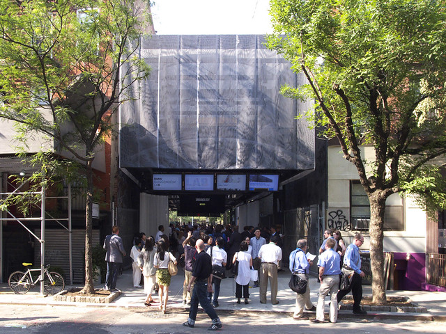
So in the work of Tsukamoto and Kajima what bridges pop culture and high culture? I'd argue first that their drawings accomplish this. Most famous are their three-dimensional "graphic-anatomy" sections that are detailed enough to describe construction while also illustrating how the spaces are scaled and used through entourage figures and furnishings. A few of these drawings are found in Primer, accompanying houses as they primarily do, but what impresses me as much (and are new to me, to boot) are the "public drawings" made for projects like the BMW Guggenheim Lab in New York's Lower East Side. Just as the 3-D sections exude life through the detailed poses of imaginary occupants, BMW and other public projects are surrounded by buildings, cars, trees, people, and other elements that make cities like New York and Tokyo so dense with life.

[BMW Guggenheim Lab, 2011. Photo by archidose]
The second way that Atelier Bow-Wow bridges high and low is, quite obviously, through their buildings, via both their forms and the ideas underlying their designs. Formally, their buildings often allude to traditional buildings, yet slightly askew in some way. The Gae House's asymmetrical pitched roof, for example, fills the eaves with glass to create a surprising space under the roof that is nevertheless rooted in the vernacular. Similarly, all of the duo's designs are based on an appreciation of the people that use them as well as the people who have shaped spaces in the past and will do so in the future. One way this appreciation comes across, beyond the highly populated drawings, is in the way designs like Miyashita Park keep elements from what came before, while also allowing for evolution, for future changes.

Yoshiharu Tsukamoto and Momojo Kajima of Atelier Bow-Wow are in a unique position among architects for being able to bridge the apparently irreconcilable poles of popular culture and high culture. While in regards to the former they may not be as strictly popular as fellow countrymen Tadao Ando and the SANAA duo, they find inspiration in the everyday and have written books on everyday, if idiosyncratic, buildings (Pet Architecture); the name Atelier Bow-Wow also exhibits their sense of humor.
On the other hand, the duo is very serious about their designs and research, carrying out much of the latter with the Tokyo Institute of Technology and the University of Tsukuba. This serious side of their work comes through in the deeply nuanced definitions that pepper their writings (Behaviorology being the most obvious) and in this "primer" that comes out of the 2013 exhibition at ETH Zurich. In this book the editors intersperse a chronological presentation of select projects with scholarly definition of key terms - like Behaviorology, but also Orientation, Occupancy, and Smallness - resulting in a book that unites these two sides of Atelier Bow-Wow.

[The Making of a Public Drawing, 2011, from "Zoom Out" entry in Atelier Bow-Wow: A Primer]
So in the work of Tsukamoto and Kajima what bridges pop culture and high culture? I'd argue first that their drawings accomplish this. Most famous are their three-dimensional "graphic-anatomy" sections that are detailed enough to describe construction while also illustrating how the spaces are scaled and used through entourage figures and furnishings. A few of these drawings are found in Primer, accompanying houses as they primarily do, but what impresses me as much (and are new to me, to boot) are the "public drawings" made for projects like the BMW Guggenheim Lab in New York's Lower East Side. Just as the 3-D sections exude life through the detailed poses of imaginary occupants, BMW and other public projects are surrounded by buildings, cars, trees, people, and other elements that make cities like New York and Tokyo so dense with life.

[BMW Guggenheim Lab, 2011. Photo by archidose]
The second way that Atelier Bow-Wow bridges high and low is, quite obviously, through their buildings, via both their forms and the ideas underlying their designs. Formally, their buildings often allude to traditional buildings, yet slightly askew in some way. The Gae House's asymmetrical pitched roof, for example, fills the eaves with glass to create a surprising space under the roof that is nevertheless rooted in the vernacular. Similarly, all of the duo's designs are based on an appreciation of the people that use them as well as the people who have shaped spaces in the past and will do so in the future. One way this appreciation comes across, beyond the highly populated drawings, is in the way designs like Miyashita Park keep elements from what came before, while also allowing for evolution, for future changes.
Inexplicably omitted from this review are key aspects of the project that go a long way to explain both the unorthodox representational product and the extraordinarily detailed dataset are. The client in this case, unless I'm mistaken, is themselves; the structure is their home. At the same time, the client is all those of us accessing the documents through publications such as this. At work throughout their design process is an awareness that the works themselves are product. Perhaps its not surprising that a young couple practicing architecture together who pull off the incredible feat of acquiring an unbuilt parcel of land in Tokyo have the leisure of time to build a brand. A bold, confident investment that is paying unprecedented dividends.
ReplyDelete