Galeria Melissa + SOFTlab
Yesterday I found myself in SoHo so I stopped by Brazilian shoemaker Melissa's store on Greene Street to check out a colorful installation by SOFTlab.
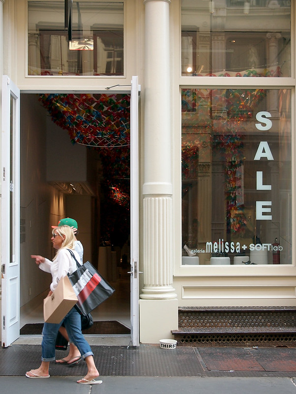
Called We Are Flowers, to coincide with a collection from Melissa of the same name, the installation consists of over 20,000 translucent flowers attached to a suspended frame (a mylar net) that billows from the front to the back of the store.
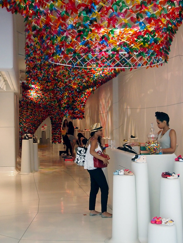
The translucent pieces overlap to blur any distinct blue, red, orange, green or yellow pieces, bringing the installation close to what SOFTlab describes as "the enchantment of a vibrant hanging garden."

In the middle of the store the arches stay above shoppers' heads, but at the back of the store it descends into the basement level.
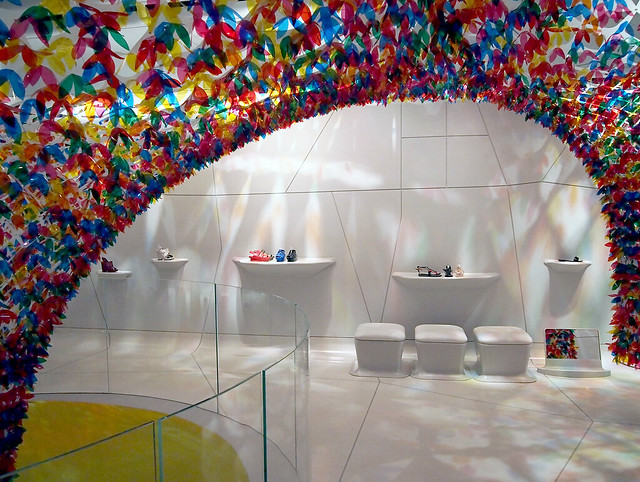
Here it is like a vortex of color...
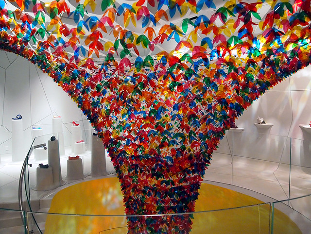
as if the (underused, I feel) elliptical yellow space is drawing all of the petals to the light at the bottom.
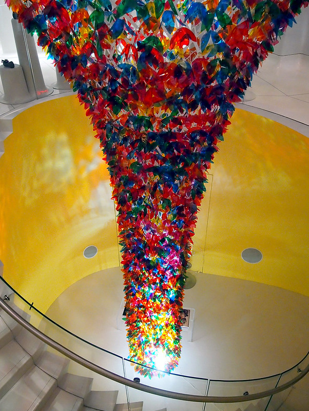
While the effect of being underneath a canopy of colorful flowers is nice...
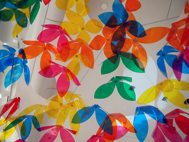
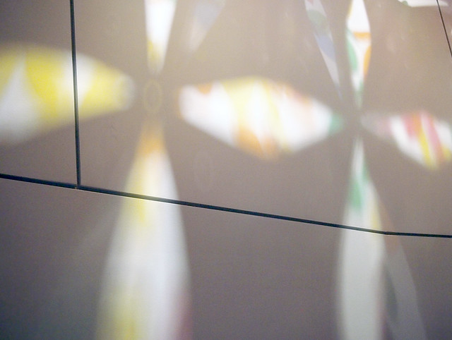
the play of light and color and form on the white walls is a great effect that unites installation and store/wrapper*.
*Melissa's NYC flagship store was realized in 2012 by designer Domingos Pascali and Edson Matsuo in collaboration with MW Arquitetura and Eight Inc.

Called We Are Flowers, to coincide with a collection from Melissa of the same name, the installation consists of over 20,000 translucent flowers attached to a suspended frame (a mylar net) that billows from the front to the back of the store.

The translucent pieces overlap to blur any distinct blue, red, orange, green or yellow pieces, bringing the installation close to what SOFTlab describes as "the enchantment of a vibrant hanging garden."

In the middle of the store the arches stay above shoppers' heads, but at the back of the store it descends into the basement level.

Here it is like a vortex of color...

as if the (underused, I feel) elliptical yellow space is drawing all of the petals to the light at the bottom.

While the effect of being underneath a canopy of colorful flowers is nice...

the play of light and color and form on the white walls is a great effect that unites installation and store/wrapper*.

*Melissa's NYC flagship store was realized in 2012 by designer Domingos Pascali and Edson Matsuo in collaboration with MW Arquitetura and Eight Inc.
Comments
Post a Comment
Comments are moderated for spam.