Charles Jencks's Evolving 'Evolutionary Trees'
I'm not going to attempt to explain or decipher architect and historian Charles Jencks's famous Evolutionary Tree diagrams, but with the publication of one in an article at Architectural Review, and having had one from 2000 on my Flickr account for a while (easily the most frequented image on my account, with over 20,000 views), I decided to see what other iterations are floating around the Internet. So four of his Evolutionary Trees are below in reverse chronological order, but if you can point me to more versions please leave a comment and I'll add them to this post.
"The author’s diagrams of Late, Neo and Postmodernism have never featured less than six streams to each of these large composite rivers, making 12 to 18 competitors at any one time" (image found online in article by Jencks, "In what style shall we build?" in Architectural Review, published March 12, 2015):
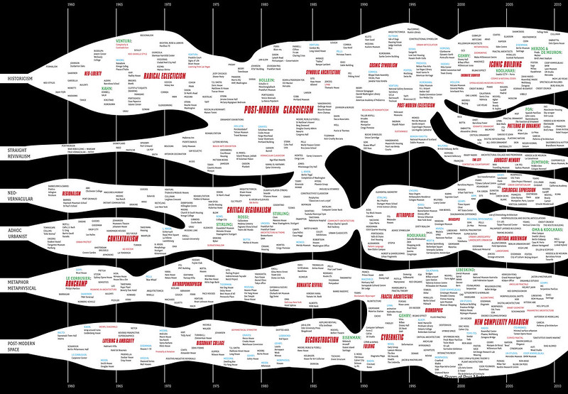
"Post-Modern Evolution – Evolutionary Tree" in The New Paradigm in Architecture: The Language of Postmodernism, published 2002 (scan found at Remix the School House):

"The Century is Over, Evolutionary Tree of Twentieth-Century Architecture" (scanned from Architectural Review, July 2000, p. 77):

"Charles Jencks, Evolutionary Tree of Post-Modern Architecture, 1960-1980" (image found at Archive of Affinities):

"The author’s diagrams of Late, Neo and Postmodernism have never featured less than six streams to each of these large composite rivers, making 12 to 18 competitors at any one time" (image found online in article by Jencks, "In what style shall we build?" in Architectural Review, published March 12, 2015):
"Post-Modern Evolution – Evolutionary Tree" in The New Paradigm in Architecture: The Language of Postmodernism, published 2002 (scan found at Remix the School House):
"The Century is Over, Evolutionary Tree of Twentieth-Century Architecture" (scanned from Architectural Review, July 2000, p. 77):
"Charles Jencks, Evolutionary Tree of Post-Modern Architecture, 1960-1980" (image found at Archive of Affinities):
It seems likely that Jencks got the idea for these diagrams from Alfred Barr's evolutionary chart of Cubism and Abstract Art (1936). This chart has recently enjoyed quite an after-life:
ReplyDeletehttp://www.artnews.com/2012/10/02/momaabstractionfaceboo/
Thanks for pointing that out, John. Ashamed to say I wasn't aware of Barr's chart. Looking at his chart and the others collected by MoMA at ArtNews, I think a distinction between those and Jencks's charts, something that puts me in favor of the latter, is that Jencks opts for blobs while the others are more line-based. To me this makes Jencks's charts less directional or linear. Time is supplied in the X-axis, but certain movements don't necessarily lead to others or aren't connected strictly to certain other ones. Instead the movements and personalities float and gain meaning through adjacency and size. Not sure if that makes his better, but I think that's one reason I like appreciate them so much.
Delete