Pedagogy and Place at Yale
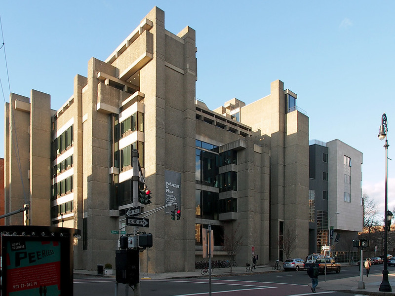
Last week I ventured up to New Haven to see "Pedagogy and Place: Celebrating 100 Years of Architecture Education at Yale", on display December 3, 2015 to May 7, 2016 at the Yale School of Architecture. The exhibition, curated by outgoing Dean Robert A.M. Stern with Jimmy "Life Without Buildings" Stamp, is made up of two halves: "100 Years of Architecture Education at Yale" and "The Architecture of Architecture Schools," with the first focusing on Yale School of Architecture and the latter emphasizing the relationship between architectural education and the places where it takes place, both at Yale and more than thirty other schools of architecture around the world. Over at World-Architects I wrote mainly about the "100 Years of Architecture Education at Yale" half, so here I'll ramble on a little bit about the latter, particularly Paul Rudolph's 1963 building, where the exhibition is located.
[All photos by John Hill, unless noted otherwise]
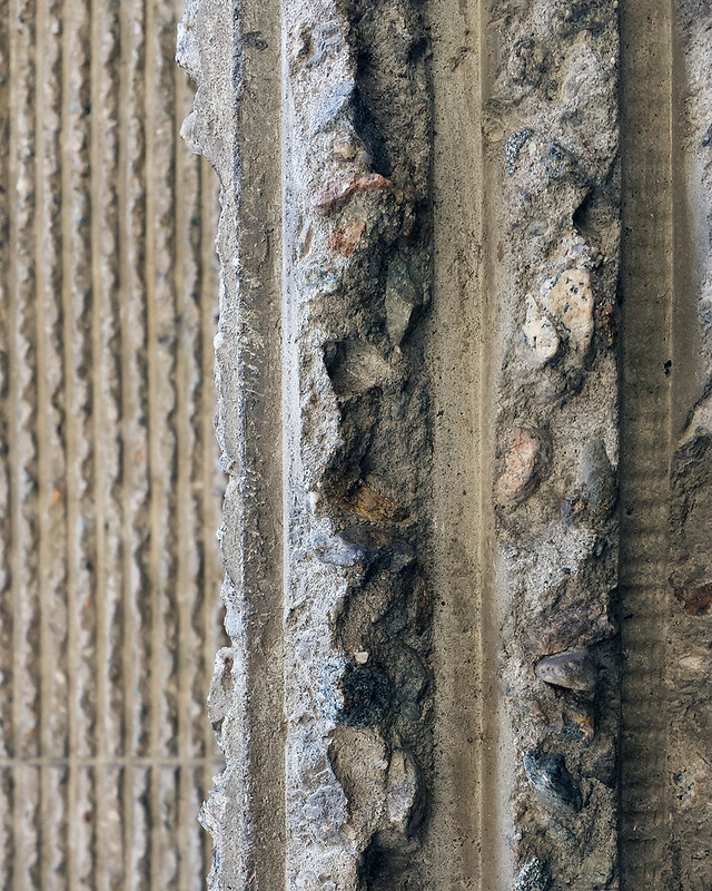
Now, I had never been to Yale or New Haven before (gasp!), so I'd yet to see Rudolph's Art & Architecture Building in person (since 2008 and the renovation and addition by Charles Gwathmey, the building has been called Rudolph Hall after its architect, who was chairman of Yale at the time). Nevertheless, I have written about the building here and there, had studied drawings and photographs of it, and therefore felt like I knew the building pretty well. From across the street it yielded few surprises, but up close I was taken aback by just how large the hammered "corduroy" stripes of the concrete are:
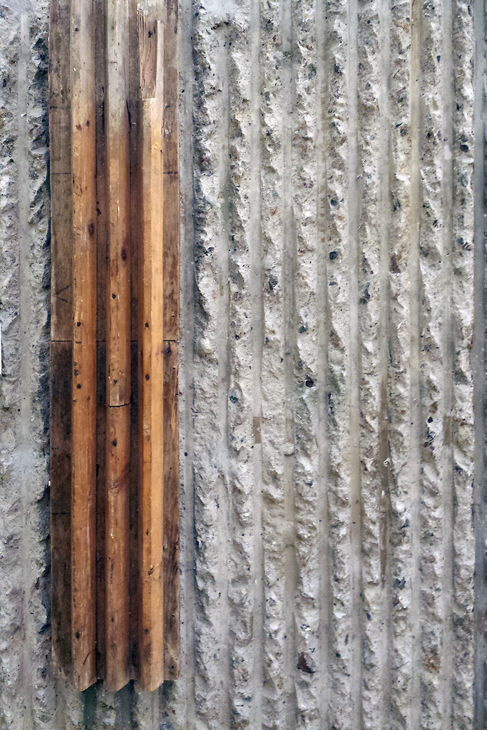
Inside, I was glad to find a piece of original formwork on display, mounted to one of the four large columns that define the exhibition space and the architecture studios on the floors above it:
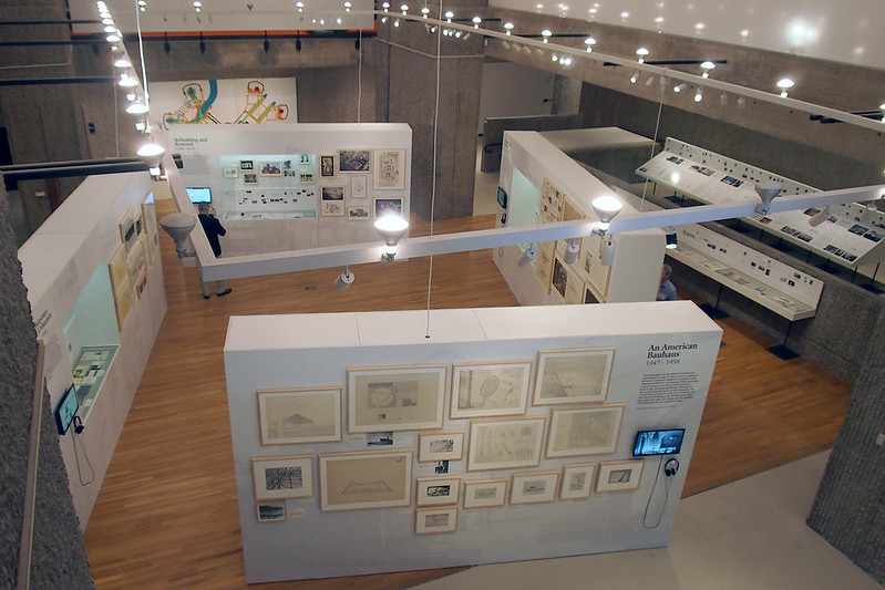
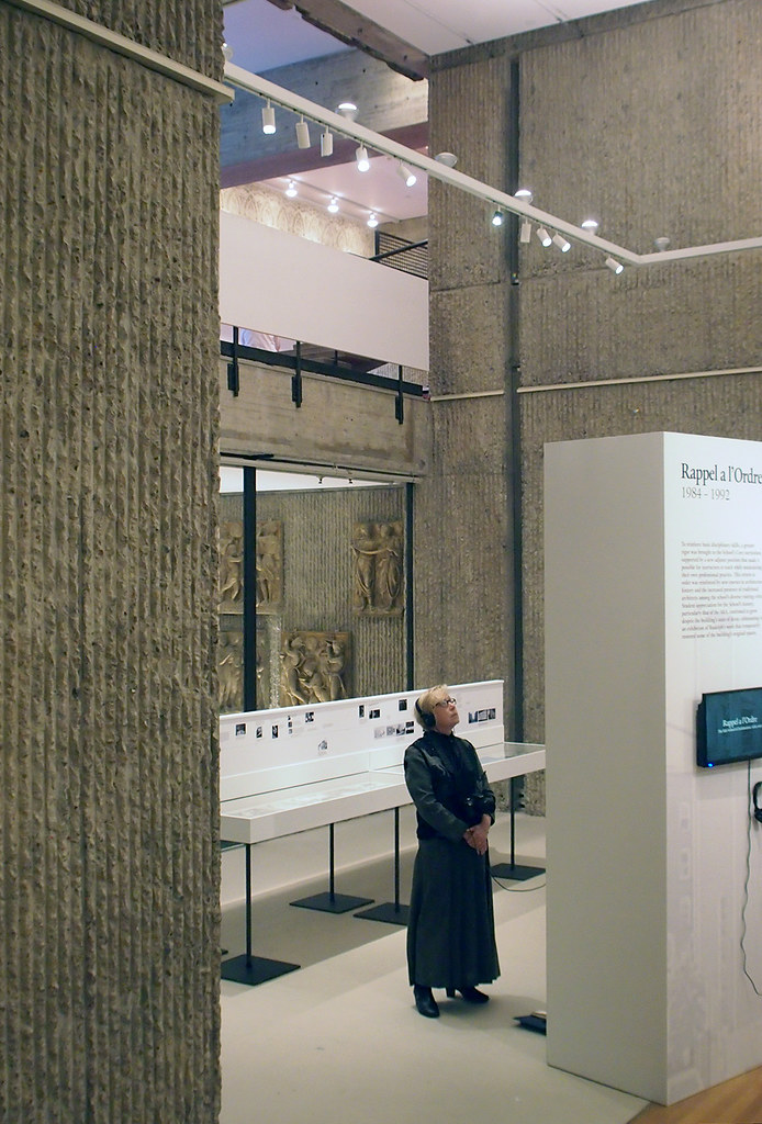
The Yale half of "Pedagogy and Place" sits in the middle of the space on four freestanding walls that skew themselves relative to the large columns, while the "Architecture of Architecture Schools" half is placed to the side, here glimpsed on the right side in this view from the mezzanine:
I didn't ask Stern or Stamp about the layout of the exhibition, but there seems to be something to the angling of the walls inside the space, most likely to make visitors more aware of the building they are inside. Although the building clearly follows an orthogonal grid in its plan, angles are rampant in its sections (famously, there are 37 levels across its 9 floors); not in the construction of the floors or other elements, but in the diagonal views up, down and across the spaces. The view from the mezzanine around the exhibition space is one case in point, as is this view across the exhibition space to the mezzanine above and the library below through a glass wall:
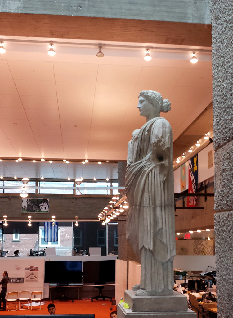
Rudolph Hall is a delight to wander (much, much more than I expected), and during my brief time at Yale to look at the exhibition, have lunch, and take in as much of the campus as I could before the ride back to Manhattan, I made sure to venture up to the fourth floor to unobtrusively walk around the architecture studios, which ring a multi-height central space that is used for crits (one was taking place that day):
Non-Yalies might think that the architecture studios were always given this central space (central both in plan and in section) in Rudolph's building, but for a long time after the 1969 fire that damaged the building they were located in the basement. Before the construction of Rudolph Hall, the studios were fitted into other spaces on campus, such as in Louis I. Kahn's art gallery across the street:
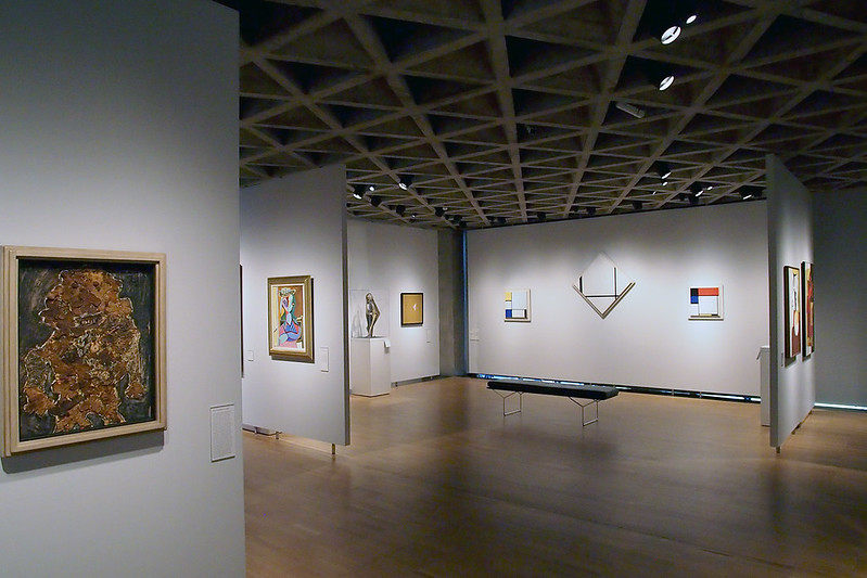
In hindsight, having studio in a Kahn building must have been great, but what's missing in the expansive, pancake-flat floors are the diagonal views and central space that are so important in Rudolph's building. Stern recounted how former chairmen and faculty would have loud arguments up, down and across the spaces, thereby involving the students (whether they liked it or not) in the verbal exchange of ideas. As well, the central space is relatively famous for the crits held there, which enable other students to watch and listen from above:

[Photo via www.gwathmey-siegel.com]
This space is so important in its current use – and I'm sure for Yale graduates who experience final crits in the space — that I can't imagine it being as effective in its original layout:

[The fourth and fifth floor studios of Yale's Art and Architecture building, 1963. Photo courtesy Yale School of Architecture.]

[All photos by John Hill, unless noted otherwise]
Now, I had never been to Yale or New Haven before (gasp!), so I'd yet to see Rudolph's Art & Architecture Building in person (since 2008 and the renovation and addition by Charles Gwathmey, the building has been called Rudolph Hall after its architect, who was chairman of Yale at the time). Nevertheless, I have written about the building here and there, had studied drawings and photographs of it, and therefore felt like I knew the building pretty well. From across the street it yielded few surprises, but up close I was taken aback by just how large the hammered "corduroy" stripes of the concrete are:

Inside, I was glad to find a piece of original formwork on display, mounted to one of the four large columns that define the exhibition space and the architecture studios on the floors above it:

The Yale half of "Pedagogy and Place" sits in the middle of the space on four freestanding walls that skew themselves relative to the large columns, while the "Architecture of Architecture Schools" half is placed to the side, here glimpsed on the right side in this view from the mezzanine:

I didn't ask Stern or Stamp about the layout of the exhibition, but there seems to be something to the angling of the walls inside the space, most likely to make visitors more aware of the building they are inside. Although the building clearly follows an orthogonal grid in its plan, angles are rampant in its sections (famously, there are 37 levels across its 9 floors); not in the construction of the floors or other elements, but in the diagonal views up, down and across the spaces. The view from the mezzanine around the exhibition space is one case in point, as is this view across the exhibition space to the mezzanine above and the library below through a glass wall:

Rudolph Hall is a delight to wander (much, much more than I expected), and during my brief time at Yale to look at the exhibition, have lunch, and take in as much of the campus as I could before the ride back to Manhattan, I made sure to venture up to the fourth floor to unobtrusively walk around the architecture studios, which ring a multi-height central space that is used for crits (one was taking place that day):

Non-Yalies might think that the architecture studios were always given this central space (central both in plan and in section) in Rudolph's building, but for a long time after the 1969 fire that damaged the building they were located in the basement. Before the construction of Rudolph Hall, the studios were fitted into other spaces on campus, such as in Louis I. Kahn's art gallery across the street:

In hindsight, having studio in a Kahn building must have been great, but what's missing in the expansive, pancake-flat floors are the diagonal views and central space that are so important in Rudolph's building. Stern recounted how former chairmen and faculty would have loud arguments up, down and across the spaces, thereby involving the students (whether they liked it or not) in the verbal exchange of ideas. As well, the central space is relatively famous for the crits held there, which enable other students to watch and listen from above:

[Photo via www.gwathmey-siegel.com]
This space is so important in its current use – and I'm sure for Yale graduates who experience final crits in the space — that I can't imagine it being as effective in its original layout:

[The fourth and fifth floor studios of Yale's Art and Architecture building, 1963. Photo courtesy Yale School of Architecture.]
Comments
Post a Comment
Comments are moderated for spam.