Disappointment in Berlin
One of the buildings I went out of my way to visit on a recent trip to Berlin was Dominique Perrault's Velodrome and Swimming Pool, a project I wrote about way back in 2000, one year after the project was completed and seventeen years before I'd see it in person. Each of the main elements is given a regular shape – pool is a rectangle and velodrome is a circle – that is set into the landscape.

[Aerial view nabbed from Perrault's website]
In the text on Perrault's website, written by Sebastian Redecke, "[the] sports buildings are unique in the city if for no other reason than that they are largely underground." This impression held true as I approached the buildings from the east, from the bottom corner in the aerial above – what turned out, unknowlingly, to be a backdoor. Basically I was approaching via the automobile access, which is logically located alongside the railroad tracks.
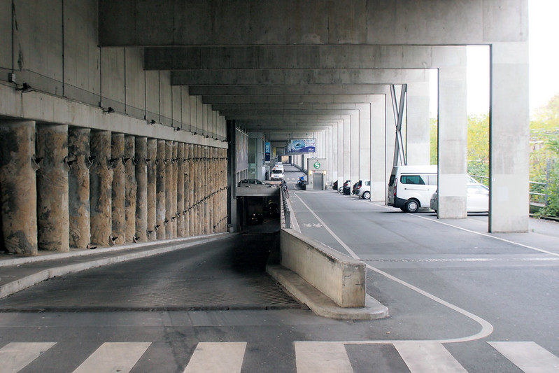
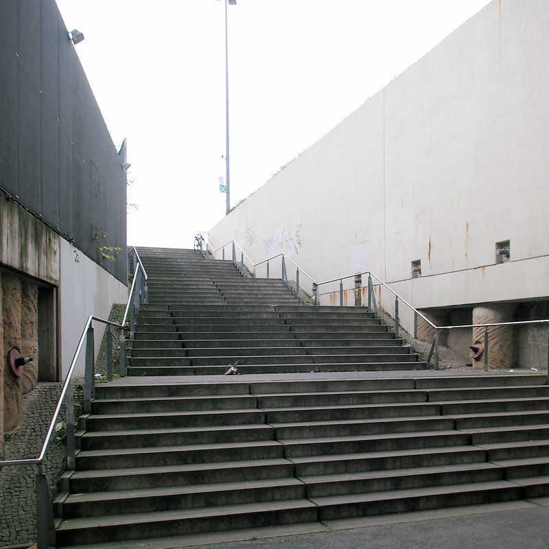
From there I went left and walked up some stairs to the eastern edge of the project, the bottom-left edge in the aerial above.
Finally I was confronted with the view I was expecting: low, mesh-covered buildings tucked into the landscape. A rectangular one:
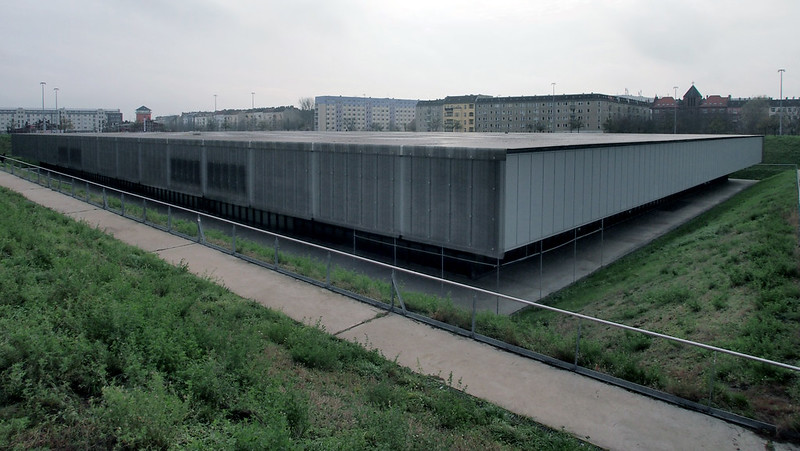
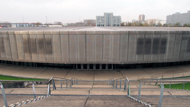
And a circular one:
My disappointment with Perrault's project firsthand stemmed from a few things: the landscape, access to the buildings, and the project's edges. All are related, but I'll discuss them one by one. First, in terms of the landscape, one does not need to visit to see how people have created their own paths across the lawns to connect the buildings and perimeter spots or just make their way across the raised landscape. Compare the aerial at top with the one below, where those new paths are visible (amazingly, both aerials are from Perrault's website, one from the project page linked above and one from the urban design page).

[Another aerial view nabbed from Perrault's website]
Normally I don't have a problem with people creating their own paths – while they serve to illustrate design defects they also show how a landscape has been made more democratic, less delegated – but here those paths are combined with other flaws: a notable lack of maintenance across much of the landscape and a thinning out of the 450 apple trees planted as part of "the orchard." The only other people I saw there (about ten of them on a chilly, gray weekday) were cutting across the elevated landscape, most via the new paths.
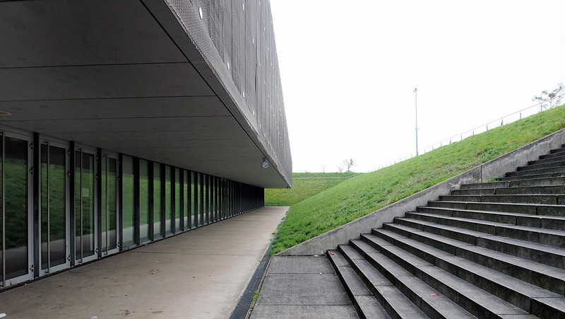
The second bit of disappointment had to do with access to the pool and velodrome. I walked down the steps (above) to get inside the pool, where I could see an event was taking place, but the doors were locked. This was the case on both sides of the pool building and at the velodrome. Instead of accessing the buildings via the elevated landscape, as seems to be the intention, entrances to the facilities are found in bulkhead structures along the northern railroad edge. (Sorry, I didn't take pictures of them.) So visitors either drive to gain access, or they walk across the elevated park to these access points; they do not descend directly to the individual buildings. This plan illustrates one such access point:

Not only did I not take photos of the bulkheads aligned along the project's northern edge, I didn't take photos of the other edges, which are basically huge expanses of steps connecting the raised landscape to the neighborhood. Here are a few views taken from Google Street View, showing the southeast corner:

The southern edge, which echoes the northern edge in terms of supplying bulkheads to the facilities, but in this case they are closed, most likely emergency exits:

And the wheelchair access in the middle of the long southern expanse:

These Street Views make it pretty clear that the project, though "largely underground," is for most people a – literally, not figuratively – elevated experience. While it's obvious that the raised landscape turns the two main components into nearly invisible volumes surrounded by lawn, it does this with unrelenting steps across most of the perimeter. And this makes me wonder if a flush edge and landscape, instead of raised ones, would have made the outdoor spaces between the main volumes more inviting and usable instead of, based on my brief visit, little used or merely conduits for getting from point A to point B.

This site section reveals that dropping the level of the landscape between the buildings could happen (at least in some places – not necessarily along the railroad edge, based on the plan above), but without allowing direct access to the velodrome and pool it would be for nought. Views into these buildings from the landscape are appealing, but without access the plan doesn't make sense – the only reason to ascend to the landscape is to circumvent it. Without the planning, use, and maintenance of the project's buildings and landscape in sync, what should have been full of potential only exhibits disappointment.

[Aerial view nabbed from Perrault's website]
In the text on Perrault's website, written by Sebastian Redecke, "[the] sports buildings are unique in the city if for no other reason than that they are largely underground." This impression held true as I approached the buildings from the east, from the bottom corner in the aerial above – what turned out, unknowlingly, to be a backdoor. Basically I was approaching via the automobile access, which is logically located alongside the railroad tracks.

From there I went left and walked up some stairs to the eastern edge of the project, the bottom-left edge in the aerial above.

Finally I was confronted with the view I was expecting: low, mesh-covered buildings tucked into the landscape. A rectangular one:

And a circular one:

My disappointment with Perrault's project firsthand stemmed from a few things: the landscape, access to the buildings, and the project's edges. All are related, but I'll discuss them one by one. First, in terms of the landscape, one does not need to visit to see how people have created their own paths across the lawns to connect the buildings and perimeter spots or just make their way across the raised landscape. Compare the aerial at top with the one below, where those new paths are visible (amazingly, both aerials are from Perrault's website, one from the project page linked above and one from the urban design page).

[Another aerial view nabbed from Perrault's website]
Normally I don't have a problem with people creating their own paths – while they serve to illustrate design defects they also show how a landscape has been made more democratic, less delegated – but here those paths are combined with other flaws: a notable lack of maintenance across much of the landscape and a thinning out of the 450 apple trees planted as part of "the orchard." The only other people I saw there (about ten of them on a chilly, gray weekday) were cutting across the elevated landscape, most via the new paths.

The second bit of disappointment had to do with access to the pool and velodrome. I walked down the steps (above) to get inside the pool, where I could see an event was taking place, but the doors were locked. This was the case on both sides of the pool building and at the velodrome. Instead of accessing the buildings via the elevated landscape, as seems to be the intention, entrances to the facilities are found in bulkhead structures along the northern railroad edge. (Sorry, I didn't take pictures of them.) So visitors either drive to gain access, or they walk across the elevated park to these access points; they do not descend directly to the individual buildings. This plan illustrates one such access point:

Not only did I not take photos of the bulkheads aligned along the project's northern edge, I didn't take photos of the other edges, which are basically huge expanses of steps connecting the raised landscape to the neighborhood. Here are a few views taken from Google Street View, showing the southeast corner:

The southern edge, which echoes the northern edge in terms of supplying bulkheads to the facilities, but in this case they are closed, most likely emergency exits:

And the wheelchair access in the middle of the long southern expanse:

These Street Views make it pretty clear that the project, though "largely underground," is for most people a – literally, not figuratively – elevated experience. While it's obvious that the raised landscape turns the two main components into nearly invisible volumes surrounded by lawn, it does this with unrelenting steps across most of the perimeter. And this makes me wonder if a flush edge and landscape, instead of raised ones, would have made the outdoor spaces between the main volumes more inviting and usable instead of, based on my brief visit, little used or merely conduits for getting from point A to point B.

This site section reveals that dropping the level of the landscape between the buildings could happen (at least in some places – not necessarily along the railroad edge, based on the plan above), but without allowing direct access to the velodrome and pool it would be for nought. Views into these buildings from the landscape are appealing, but without access the plan doesn't make sense – the only reason to ascend to the landscape is to circumvent it. Without the planning, use, and maintenance of the project's buildings and landscape in sync, what should have been full of potential only exhibits disappointment.
Hi,
ReplyDeleteI had quite the same impression, when I stayed for a few days in the hostel in the white and blue building in the bottom of the first image. At the time they also left the grass overgrow, so it looked kind of abandoned, with just few people jogging along the perimeter.
I agree the building doesn't really integrate with the surroundings and neither lives up to it's fame. Being a place you have to "climb" definitely takes away its public-park aspiration.
Maybe at least a link to the s-bahn station would have helped making it a little more alive.
(btw, the 1st image is a photoshopped version of the 2nd bird's eye view - the cars are in the same positions and the concret towards the bottom-left road doesn't look very real)
Cheers
Federico
Federico,
DeleteI realized the gray strip in the top aerial was Photoshopped, though I was hoping that the other aerial was taken at a later date and matched up precisely, minus the tracks. What you wrote, especially given the cars, makes more sense.
Thanks,
John
i enjoyed the post John. Your description and related photos were a helpful virtual tour/experience of the project. I appreciate you taking the time to do this! Patrick
ReplyDelete