Half Dose #28: House of Sweden
According to its web page, "a House of Sweden is being erected outside Sweden [for the first time], to be home to the Swedish embassy and representatives of Swedish commerce. The building will form a new Swedish arena in the United States. It is an unusual embassy building, housing a secretariat, 16 apartments and an Event Center."
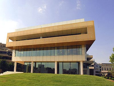
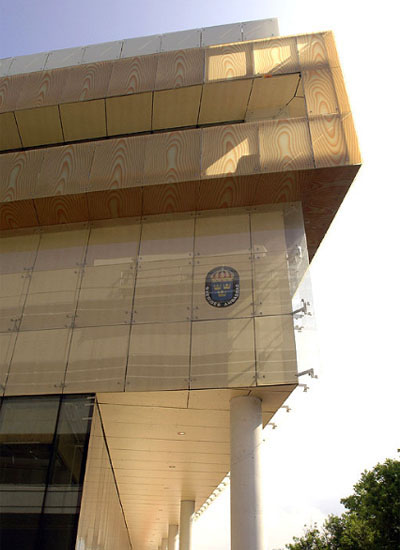
Designed by Sweden's Gert Wingardh, the building's exterior is a banded composition of various materials, predominantly glass but also wood and stone. In the middle bands, a blond maple is covered in fritted glass below a laminated glass printed with a wood grain. Ironically perhaps, the latter has a stronger impact, though the faux wood grain appears almost comic.
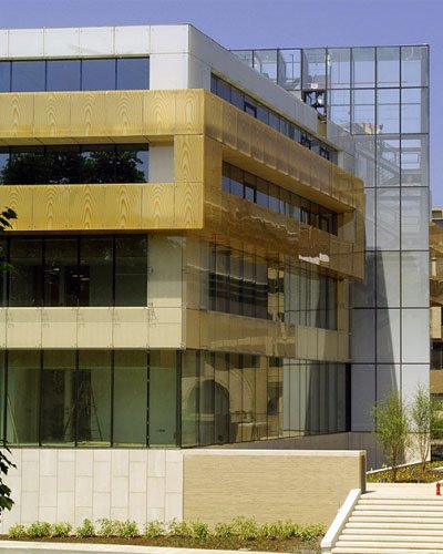
This horizontal banding reflects the variety of uses within the House of Sweden: basement event center, ground floor public areas, 2nd floor Embassy, 3rd and 4th floor apartments, and finally roof terrace. Most likely intentional is the ground floor's transparency, featuring an all-glass storefront will open in selective areas to allow public access.
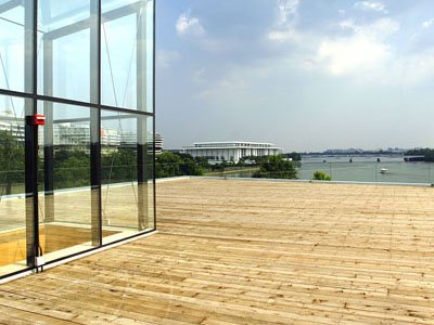
As can be seen in the image below, the site "commands a spectacular view of such landmarks as Georgetown, Watergate and the Kennedy Center." Having broken ground back in April 2004, the building is approximately two months from completion.
Links:

Designed by Sweden's Gert Wingardh, the building's exterior is a banded composition of various materials, predominantly glass but also wood and stone. In the middle bands, a blond maple is covered in fritted glass below a laminated glass printed with a wood grain. Ironically perhaps, the latter has a stronger impact, though the faux wood grain appears almost comic.

This horizontal banding reflects the variety of uses within the House of Sweden: basement event center, ground floor public areas, 2nd floor Embassy, 3rd and 4th floor apartments, and finally roof terrace. Most likely intentional is the ground floor's transparency, featuring an all-glass storefront will open in selective areas to allow public access.

As can be seen in the image below, the site "commands a spectacular view of such landmarks as Georgetown, Watergate and the Kennedy Center." Having broken ground back in April 2004, the building is approximately two months from completion.

Links:
:: House of Sweden
:: Embassy of Sweden
:: Gert Wingardh
I think it is being coordinated by VOA ,a national architectuural firm.
ReplyDeleteWhat an ugly building!
ReplyDeleteWood printed on glazing?
Quite the post-modern statement they're trying to make.
It seems more sheditecture with glitter sprinkles than architecture.
You better check what Rem Koolhaas prints on all kind of materials in his buildings...Or may be because he is Koolhaas, he can do whatever and everyone should say, amazing!
ReplyDeleteStaying at the Watergate around the corner, I walk by the building each day.
ReplyDeleteThis new building is significant in regards to D.C.s otherwise lock-in-step, bland contemporary architecture. Maybe over time, as the architecture and setting start to age together into some kind of unity, and soften certain hard qualities of the formal aspects of its architecture (a bit of Herzog dM influence here, and so on) it will provide whatever subtlety people think is missing.
But more importantly, the pics you have are very cropped - and all taken close to the building as if it is only “a face”, or a p.o.v. from the building, just cutting out the very near right side - and dont show you the context, or how the complete building responds to it. Which in this case, is everything. That pattern you read so closely, is quite different in context. I think it really is a good response to its tight, schizoid site. One side of the long building is executed in undulating waves and step-sequences, responding what it borders – a wide, yet quiet, meandering river stream, with surrounding trees, brush etc.. Walking from the Watergate over to this building one is able to visually connect those two buildings, and this undulating side also reflects the sensibility of its famous architectural neighbor in view.
But in contrast, the other side of the building is pure straight lines, butted directly against the one-lane side street that separates it from high-density commerce (housing, restaurant, outside cafes, etc.) literally some feet away.
Due to the surrounding, it takes some time to walk around the building, and this provides a kind of unity, as you never really get the chance to literally compare these distinctly different sides but just sense it unfold as you walk. In this way, it took great advantage of the area and connects to its site. And that patterned-sectional, bringing in the organic line of one building side, with the hard edge functionality of the other side, functions like a joiner as well, synthesizing while it holds the two forces in check visually, but not overpowering either.
But what I question is: purpose-built embassy architecture (as opposed to just inhabiting some address) is clearly intended as a pose, a gesture of the relationship, intended or real, between nations. And in D.C., whose overall symbolic capital stems from the flows between embassies, cultural centers, this building is odd and out of place. I mean – just HOW important is Sweden’s relation to the U.S.? I would be truly curious about some agenda implied here… from Sweden, one of the nations least likely to “show-off”… What do they want to prove with it – it’s a bit… UPFRONT, ‘look-at-me-now’ kind of attitude.
So it resides uneasily. Either the Swedes don’t understand how thing are done in d.c., and are going all “transparency” on us without getting the idea, or they have some idea of what they are doing, and I wonder just WHAT? It is not on any normal embassy row area, or where there is any related foot traffic – but just… a very specific kind of tourists area. There is no multi-purpose reason to go there. And the one reason, doesn’t match any embassy or cultural “house of…” purpose really. It is the smaller harbor-services area, where large powerboats double-park on the dock on the weekends, blasting music, as well the strip of restaraunts, bars and so on along the condensed strip – and will never change, as it is one of the few places on the water they CAN do that in d.c. And since 9-11, most of the time, military helicopters fly very low and LOOUUDD along the river (the pentagon is in view, just across the river) every 15 min or so, drowning out ones conversations in those same outdoor cafes, and along the harbor. As more “important” events would take place in the embassy, as more helicopters, etc…
In D.C. you don’t get this spot by just shopping for it. All this stands for is a claim “hey we afforded this ridiculously overpriced, tough to obtain due to zoning, waterside address!” For? – a couple of apartments overlooking the Potomac? For all our famous er…parties? for what rational? Walk-in publics from..? Business-lobbyists have other ways of being satisfied, a view to the Potomac aint going to do it. Also – they ALL like some privacy - not transparency, symbolic or real - when attending things, if you can get my drift…
What it does look like, is a hedged-bet, a building that overnite could become offices and a downstairs storefront or restaurant, etc…
Thanks for your comments, Art. These images definitely illustrate the shortcomings of photography, paricularly architectural photography that aims to exclude its context and focus attention on the building and design being presented. Photos in magazines and on the web that show a building in its context are so rare that when I find one it amazes me. I remember an aerial view of Eric Owen Moss's Lawson/Westen house showing it penned into its suburban context; the effect with other photos is far from truthful. Maybe one of these days I'll compile some images that present buildings in the more unflattering poses.
ReplyDeleteMoving on, your questions about the thought behind the embassy's function and siting will probably remain unanswered. The building's aesthetic may be trying for something akin to the country's largest export: IKEA. Where that store exports a contemporary aesthetic for cheap, this design might be saying that that aesthetic permeates the culture, even at a more refined and less-cheap level. Perhaps the Swedes were unaware of the area's shortcomings, of the qualities you mention.
Archi-photos are really a subject for sure. Maybe you can bundle it with a special d.c. daily dose tour. Lots there to show in regards to how it is and how it is pictured.
ReplyDeleteI would agree with the IKEA-inspiration philosophy to some degree. I guess its the first example of a contemporary, pattern-printed building in d.c. as well.
As for the area, I just feel as it is the LAST place one could have gotten a waterfront view on the river near those sites you mentioned, it would have been some pricey decision. Irregardless if the Swedes knew what they were doing in this ambassadorial choice, they knew where all there colleagues are or aren't located, and what this area is, so decision-wise it is intriguing.
You have great site.
ReplyDeleteOn the Tate Modern, please allow me wonder if 'modern' in Tate stands for a chaos that we may be living in.... reflecting on the form of the building by the Swiss Architects
JJ. Khurana