For the Love of (Architecture) Books
Tomorrow is Valentine's Day, so I put together a list some things I love ❤️ about architecture books — and just as many things I don't love 💔 about them: 20 pairs in 4 categories. I can't be alone in having these opinions and I might be a bit harsh in my criticisms, but if I left something out or if you disagree with me, please comment.
Book Browsing + Buying:
 |
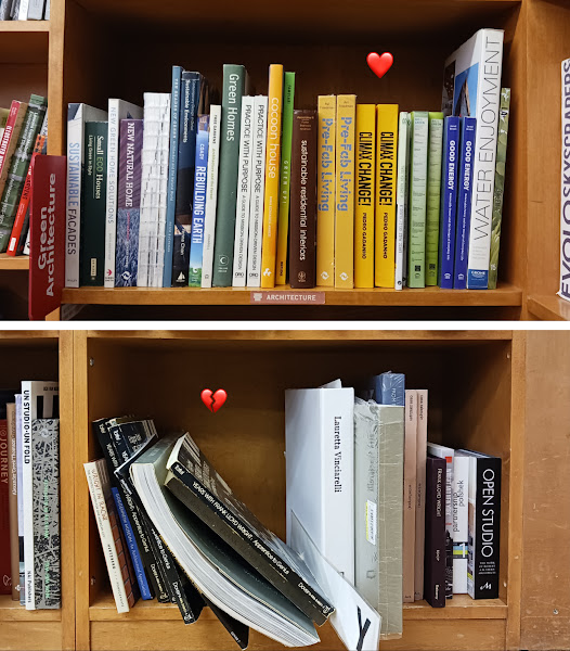
| "18 miles of books" is a lot to keep organized. |
I ❤️ Browsing a well kept bookstore
I 💔 Browsing an unkempt bookstore
Sometimes, as in the pair of photos above, they are one and the same.
I ❤️ Finding books on Amazon – a decade ago
I 💔 Finding books on Amazon – today
I 💔 Finding books on Amazon – today
I'm just looking for architecture books, so no need to hit me with Prince Harry's new book on Every. Page. Of. Search. Results.
I ❤️ The smell of books, be it that distinctive used bookstore scent or the whiff of a new book after peeling off its plastic wrap
I 💔 Opening the envelope with that book I bought in "good" condition from a third-party seller two weeks ago, only to discover in my nose that it was stored in a dank basement that was home to a cigar-smoking cat
Buyer beware!
I ❤️ Buying new and used books from William Stout Architectural Books
I 💔 Searching the website of William Stout Architectural Books
It's the best architecture bookstore in the US, if not the world, but why can't I filter out the "Sold Out" books? Why can't I browse the "Sale" books? Why can't I sort the categories or searches?
I ❤️ Browsing a used bookstore and coming across a hard-to-find book that has been on my wish list for a long time
I 💔 Opening the same book and seeing it underlined beyond reason
I don't mark in the books in my library, and I don't care if you do, but unless you're someone like Rem Koolhaas marking up a Jane Jacobs book, please don't dump your underlined/highlighted books at used bookstores.
Books as Objects:
I ❤️ Books that fit in coat pockets
I 💔 Books that require their own stands
Yes, in the photo above, that is a Phaidon Atlas of Contemporary World Architecture book stand, spotted at Rizzoli Bookstore.
I ❤️ Lay-flat (stitched) binding
I 💔 "Snap-shut" (glued) binding
Remember publishers: Architecture books are illustrated books with drawings and other images that often span two pages and are best looked at flat on a desk or table.
I ❤️ Paperback flaps
I 💔 Paperback "curls"
The flaps help paperbacks keep their shape over time, but the combination of no flaps and certain cover constructions can lead to curls and — worse yet — bent corners when putting them back on the shelf.
 |
| An old Diller + Scofidio book with a subtle yet permanent curl. |
I ❤️ Ribbon bookmarks in guidebooks
I 💔 Ribbon bookmarks in coffee table books
The first are practical, the second are frivolous and serve to raise the price of already pricey books.
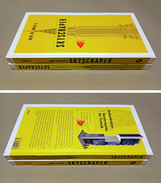
I ❤️ Titles facing → on a book's spine
I 💔 Titles facing ← on a book's spine
The latter seems to be a standard with European books, but it results in books facing the "wrong" way on a bookshelf and, as in the photos below (of English and German copies of my skyscraper book), the back of a book being face up on a table when the title on the spine is upright.
 |
| Which way is up? |
Book Design:
 |
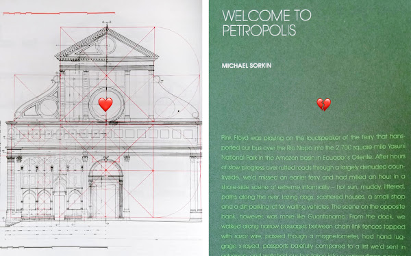
| This drawing is easier to read than this text. |
I ❤️ Black and white and red all over
I 💔 Color on color
Red lines on black and white drawings add a layer of information easily grasped via contrast, but using two colors together makes text or drawings hard to read in all but the brightest light conditions.
I ❤️ Good type design and layout
I 💔 Bad type design and layout
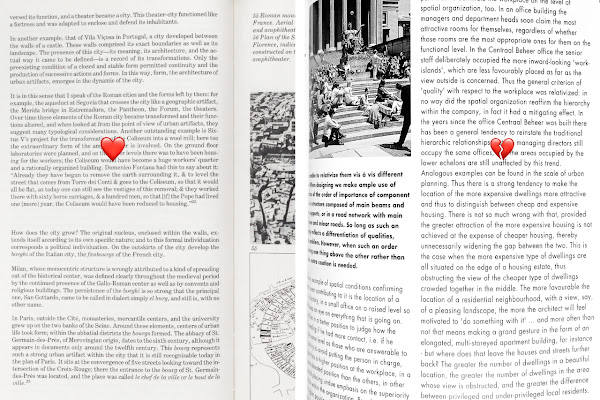
Graphic design should entice people to read, not discourage reading; in the latter case paragraph breaks that are hard to discern is but one example, illustrated below.
 |
| Massimo Vignelli, at left, knew what to do, unlike the designer who made the ragged, unindented, no-spaces-between-paragraphs layout on the right. |
I ❤️ Sensible margins
I 💔 Text disappearing into the gutter
This should be obvious to publishers and designers, but it still happens; I chalk it up to books being laid out on screens and then being made as ebooks as well as print books. See also: lay-flat vs. snap-shut binding.
 |
| Who did it better: an old Frank Lloyd Wright monograph or the latest AIA Guide to Chicago? |
I ❤️ Vellum pages inside a book
I 💔 Vellum covers and dust jackets
The first, a very 90s way of layering drawings over other images, is still appealing to me, but the few books I have with vellum covers or dust jackets are all damaged: creased, chipped and/or discolored.
I ❤️ Matte colored pages
I 💔 Glossy black pages
The first work well as chapter dividers and other ways of organizing a book, but the second just end up becoming canvases for displaying fingerprints.
Book Content:
 |
| These are among a few of my favorite things. |
I ❤️ Magazines from Japan (A+U, GA, JA)
I 💔 The ¥ of magazines from Japan
Individual copies of A+U, for example, are 3000¥ + shipping — that's more than $40 per issue! And old/used copies of magazines from Japan are not much cheaper, if not considerably more expensive.
I ❤️ Dissertations, edited
I 💔 Dissertations, unedited
The research and scholarship of PhD dissertations makes their publication logical if not necessary, but without a good editor making them more accessible to a wider audience — and without a good designer to make them more visually appealing, too — don't bother. A good example is Designing TWA: Eero Saarinen’s Airport Terminal in New York by Kornel Ringli.
I ❤️ Series, completed
I 💔 Series, derailed
Not all book series have a set number of volumes, but it's disappointing to discover planned series that, for one reason or another, never moved beyond, say, the first one or two titles.
 |
| Kenneth Frampton oversaw the 10-volume World Architecture 1900-2000 – A Critical Mosaic, which I've patiently assembled since learning about it in 2015, but unfortunately Ada Louise Huxtable realized only the first of the planned six volumes of The Architecture of New York: A History and Guide. |
I ❤️ Reprints of classic, hard-to-find books
I 💔 Low-quality versions of public domain books
A reprint of The Notebooks and Drawings of Louis I. Kahn, complete with linen cloth cover with stamped gold and other details? Yes, please. A copy of John Ruskin's Seven Lamps of Architecture from "CreateSpace Independent Publishing Platform"? Nope. (And Dover reprints might get a bad reputation, but I find the quality of the papers and reproductions exemplary for such affordable books.)
I ❤️ Book-length case studies of buildings
I ❤️ Book-length case studies of unbuilt projects, of books, of landscapes, of artworks, ...
Yes, there isn't anything about case studies that I don't love...or nothing I can think of. It's a subgenre of architecture books I've professed an affinity for many times on this blog. In fact, case studies will be the subject of next week's dose.

Comments
Post a Comment
Comments are moderated for spam.