Grimshaw vs. Stern
John Jourden may have beaten me to the punch, but I still feel the need to compare, and share with everybody, the New York City Department of Transportation's choice for its new street furniture -- designed by Britain's Nicholas Grimshaw -- with Chicago's shelters designed by Robert A.M. Stern, which I posted briefly about a couple years ago.

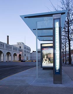
Grimshaw's design (above) is "made of stainless steel, anodized aluminum, and tempered glass," according to a news brief at Architectural Record. The roof is cantilevered glass, supported by tapered steel sections. A piece of cantilevered glass in the foreground allows for additional shelter from the wind, while the back portion clearly indicates the shelter's location in the city.

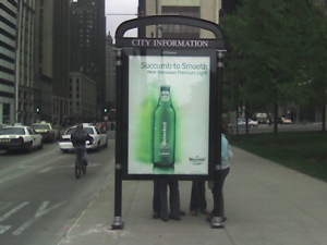
Where Grimshaw's design trumpets its better materials (no painted finishes or plastics, which are "less durable over the long term") and neutral impact (it touches the ground at two spots due to a steel plate anchored under the pavement), Stern's bulky shelters are primarily painted steel and aluminum, they touch the ground at six points (sometimes more), and they're bolted through small concrete pads (for leveling) to the sidewalk below, meaning they aren't so much anchored to the ground as set upon it.
Unfortunately, the Chicago image illustrates that the Stern shelters just might be the right fit for a city that requires bulky, pseudo-wrought iron fencing to define parks and other open spaces, and that feels the need to erect badly designed obelisks at every point of entry into a neighborhood, a la Lincoln Square's above.

But more than the design of these things, what's really irked me lately are the free-standing, two-sided billboards labeled "City Information." As of yet have I seen one with any useful information, like a map or a list of places of interest in the immediate vicinity. Instead, we're bombarded with more ad revenue for JC Decaux, in the case via Heineken.
The above image was taken from Hello Beautiful!, where Edward indicates that some actually do have maps. These appear to be the minority in the city's ever-increasing Ad-scape.

Grimshaw's design (above) is "made of stainless steel, anodized aluminum, and tempered glass," according to a news brief at Architectural Record. The roof is cantilevered glass, supported by tapered steel sections. A piece of cantilevered glass in the foreground allows for additional shelter from the wind, while the back portion clearly indicates the shelter's location in the city.
Where Grimshaw's design trumpets its better materials (no painted finishes or plastics, which are "less durable over the long term") and neutral impact (it touches the ground at two spots due to a steel plate anchored under the pavement), Stern's bulky shelters are primarily painted steel and aluminum, they touch the ground at six points (sometimes more), and they're bolted through small concrete pads (for leveling) to the sidewalk below, meaning they aren't so much anchored to the ground as set upon it.
Unfortunately, the Chicago image illustrates that the Stern shelters just might be the right fit for a city that requires bulky, pseudo-wrought iron fencing to define parks and other open spaces, and that feels the need to erect badly designed obelisks at every point of entry into a neighborhood, a la Lincoln Square's above.

But more than the design of these things, what's really irked me lately are the free-standing, two-sided billboards labeled "City Information." As of yet have I seen one with any useful information, like a map or a list of places of interest in the immediate vicinity. Instead, we're bombarded with more ad revenue for JC Decaux, in the case via Heineken.
The above image was taken from Hello Beautiful!, where Edward indicates that some actually do have maps. These appear to be the minority in the city's ever-increasing Ad-scape.
If I get to pick ads over taxes, I pick ads!
ReplyDeleteWait, we're talking about architecture, not politics.
Or are we...
God, I need sleep.
Thank you for a lovely blog. I was wondering if you have ever heard of new green methods of creating electricity? There are currently Wind, Waste, Water, and Solar methods to generate the electricity needed to go green. All of these methods are a thing of the past. The new generation is a machine called the JP Green. Are you interested in using this technology that puts all other methods of generating green electricity to shame?
ReplyDeleteBest Regards,
Jorge Perez
Avant-Garde Green Energy Engineer